
Flatbush Co-Op Curbside Shopping APP
Tools: Sketch, Illustrator Role: UX/UI Timeline: 2 weeks
Overview & Objective
Since Coronavirus began I have been following how the market has adapted to the psychology of the consumer. The article Changes in Grocery Shopping Habits During COVID-19 had a huge impact on how I view what local shops are doing during this time.
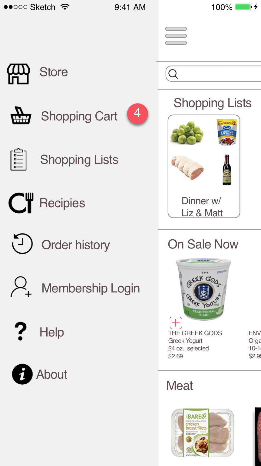
I wanted to create an app for the local Co-Op which is community funded & more susceptible to changing consumer habits than a chain supermarket. The app will allow customers to order groceries online. Keeping both the workers and the community healthy and safe.
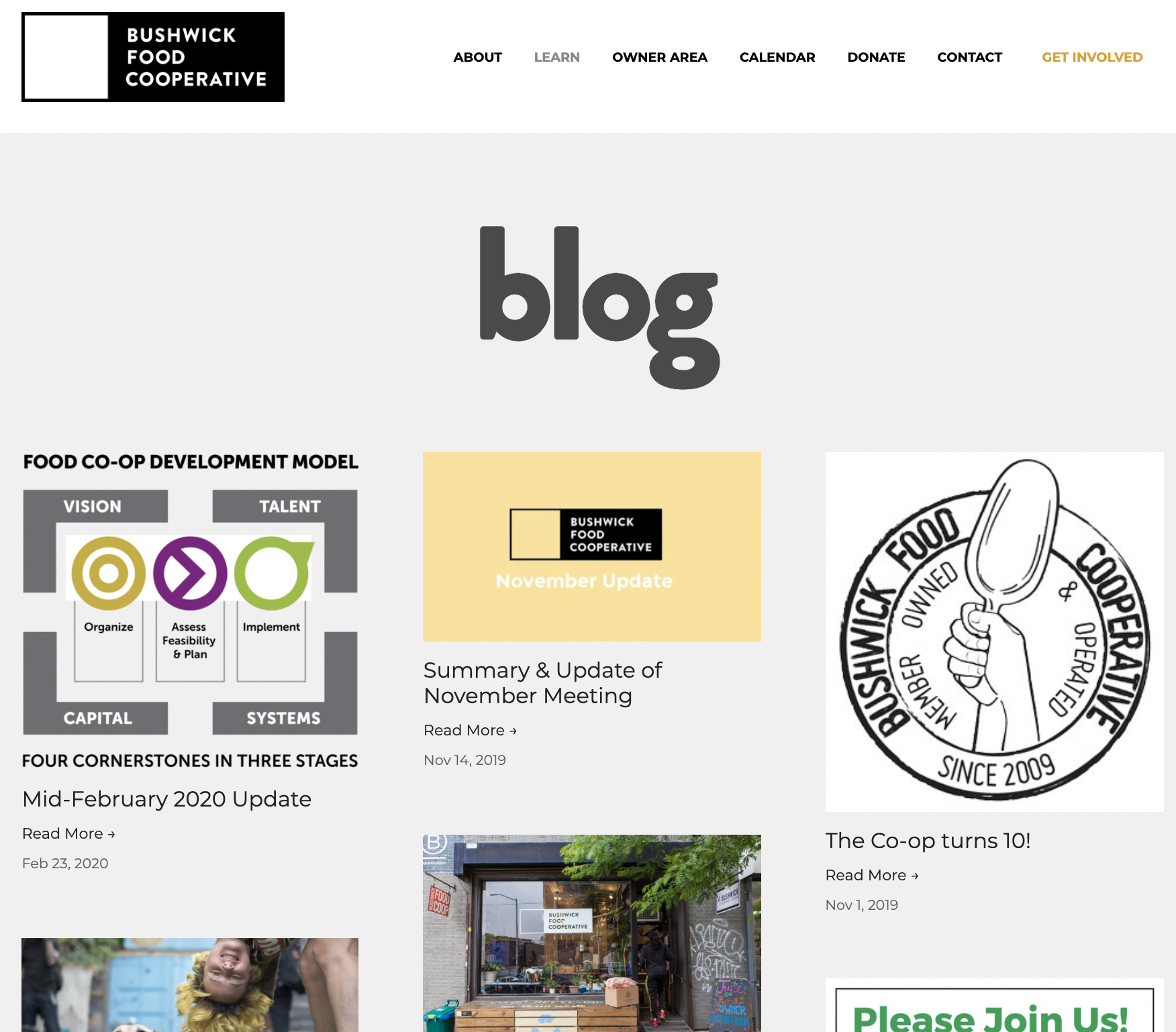
Competitor Apps
Looking at similar scale Co-Ops & Big Box apps shed light on the similarities & difference when shopping local-vs-national.
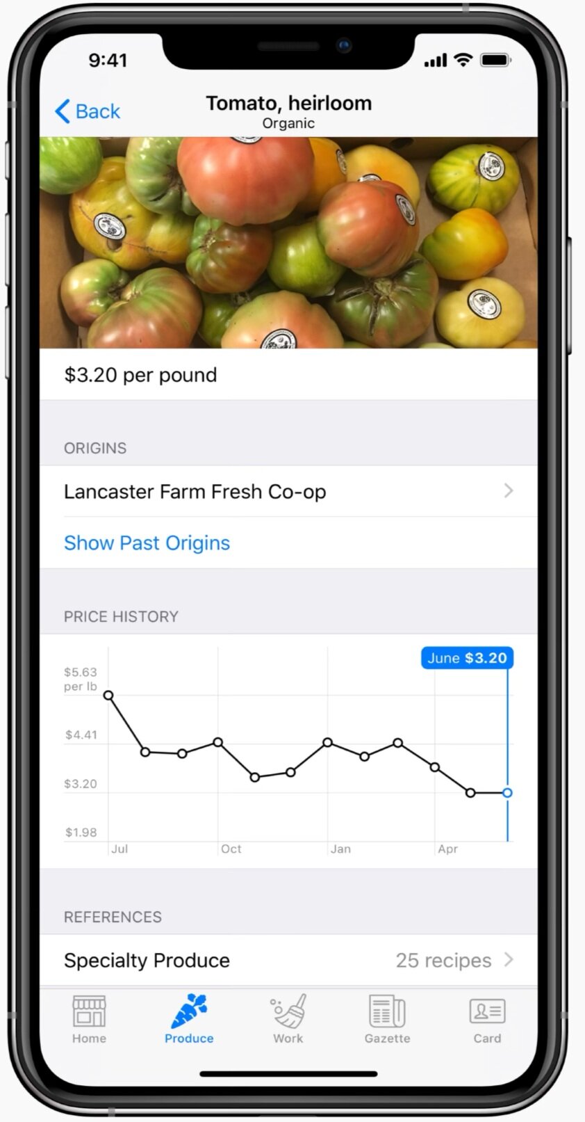
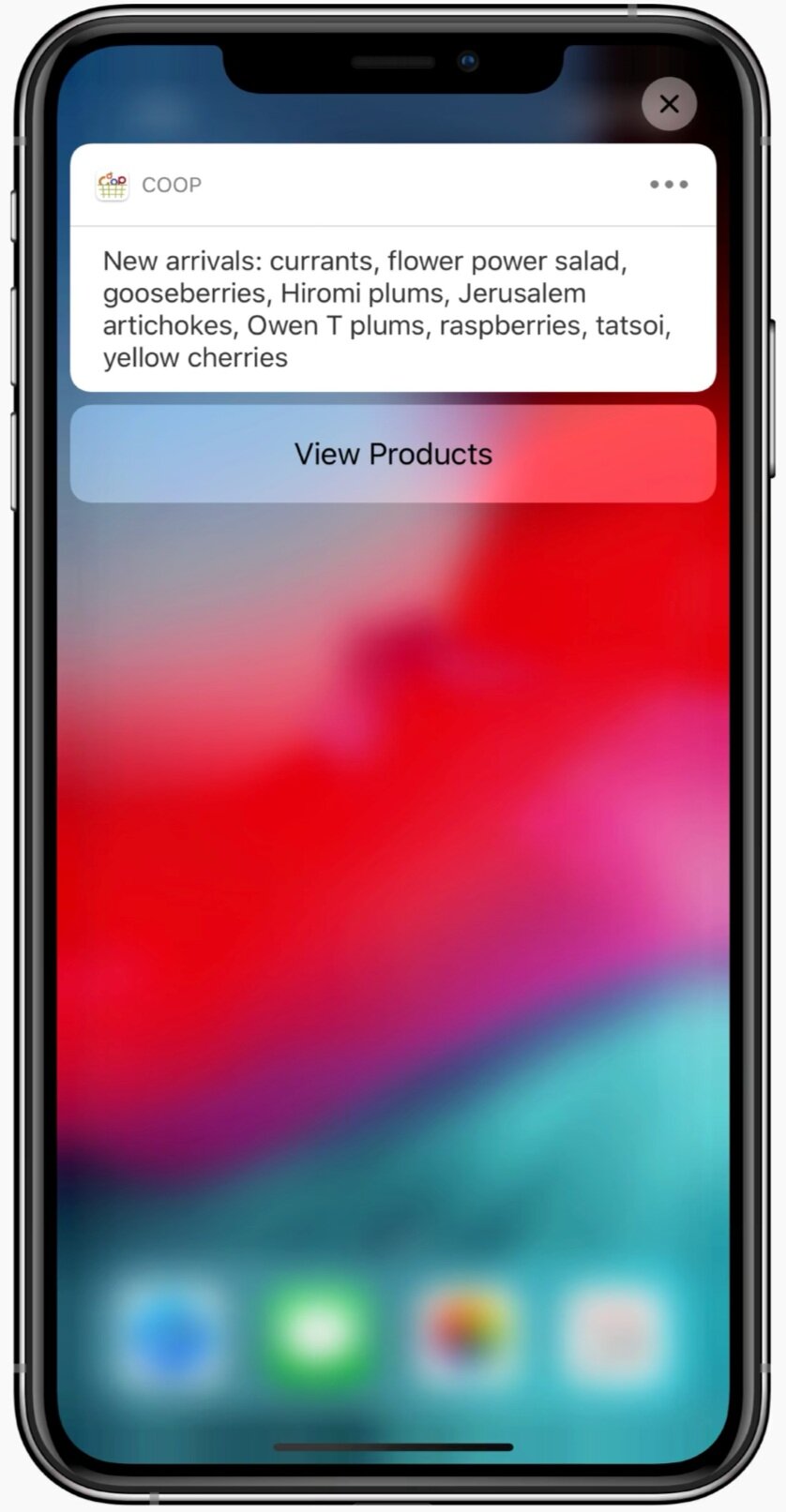
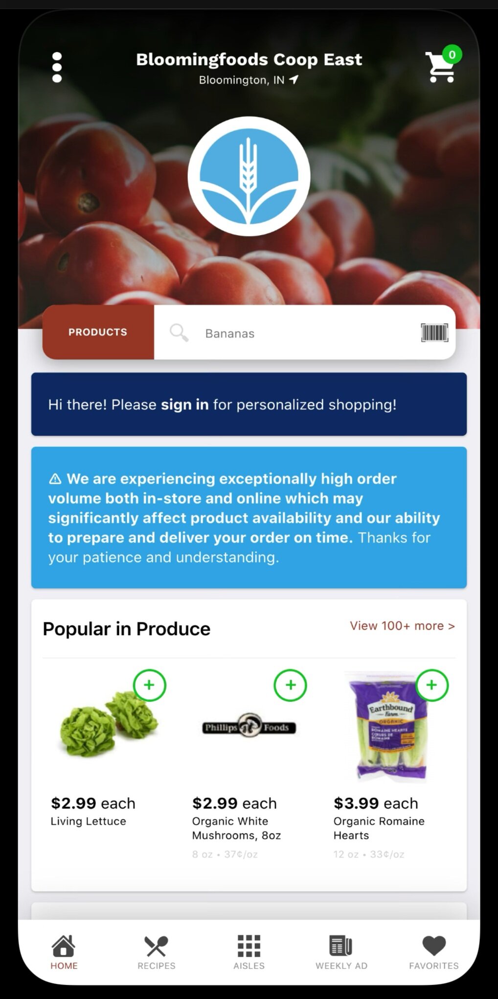
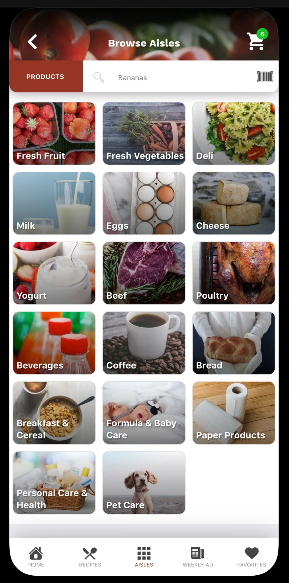
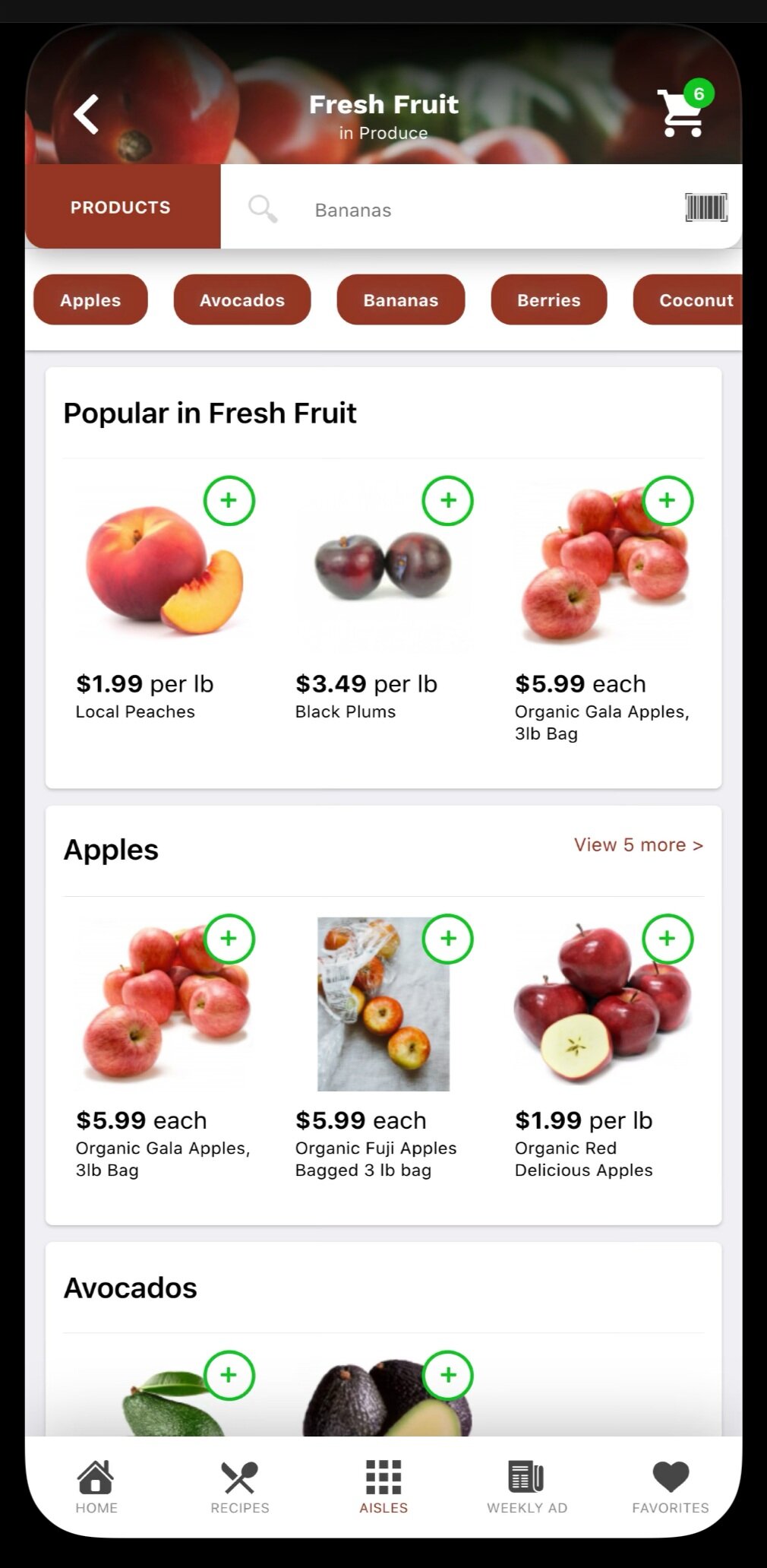
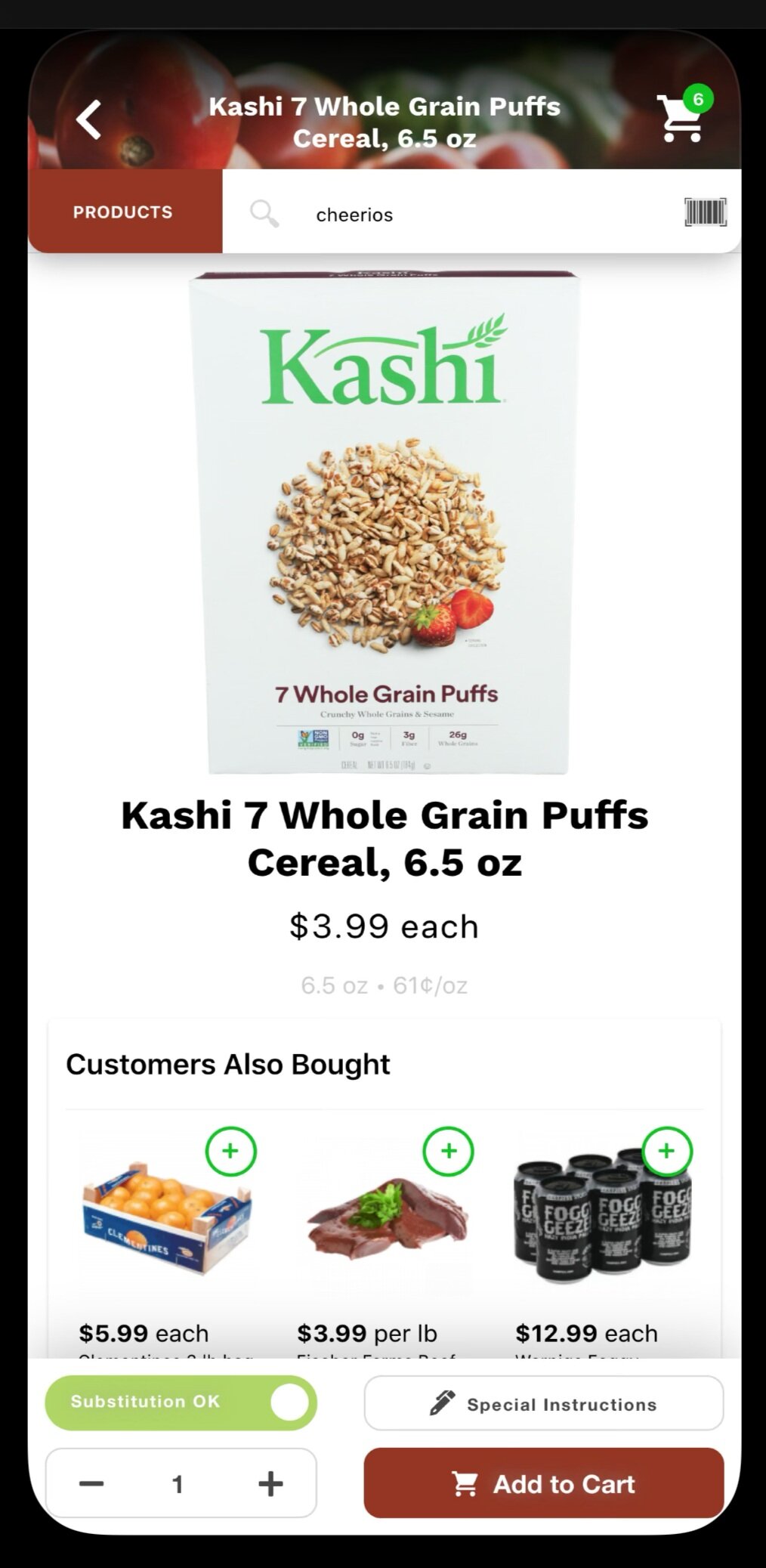
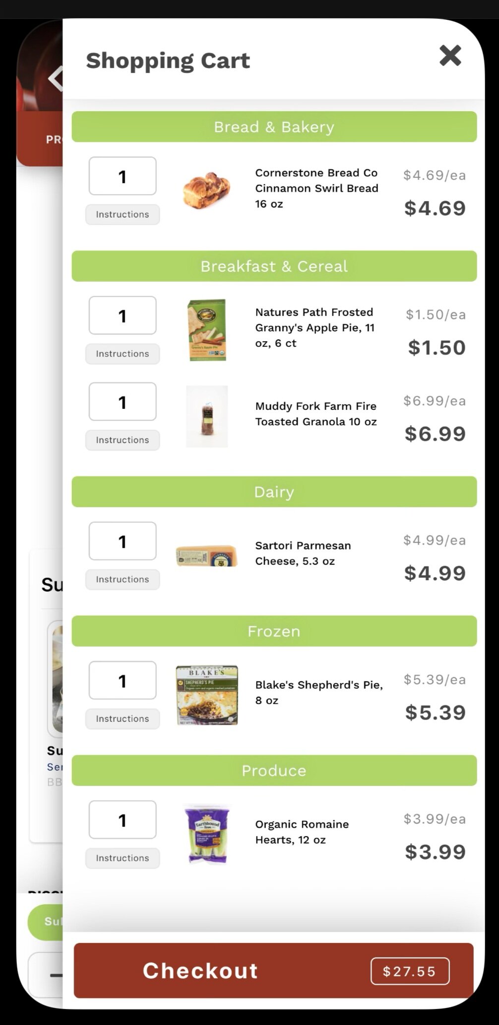
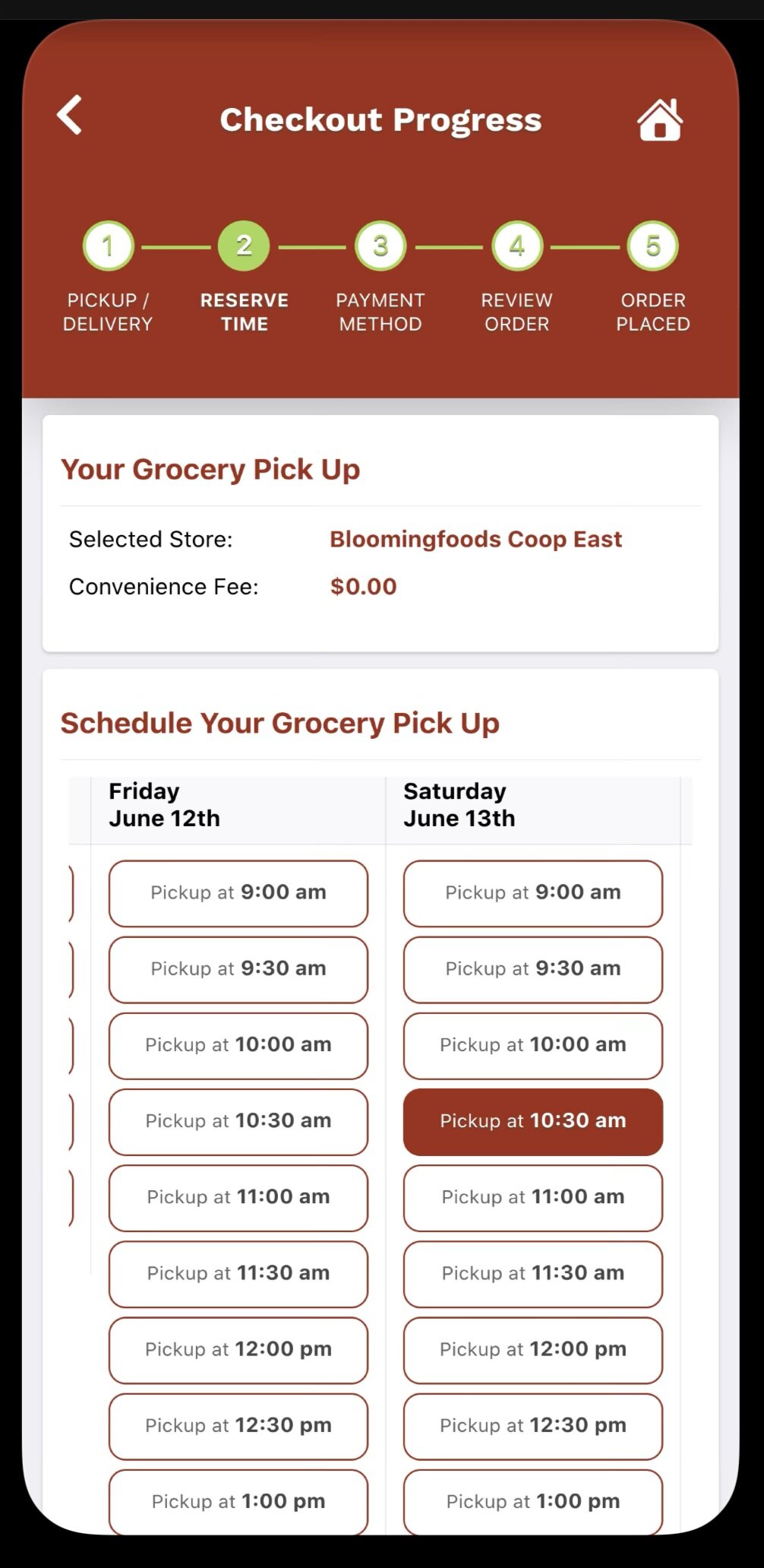
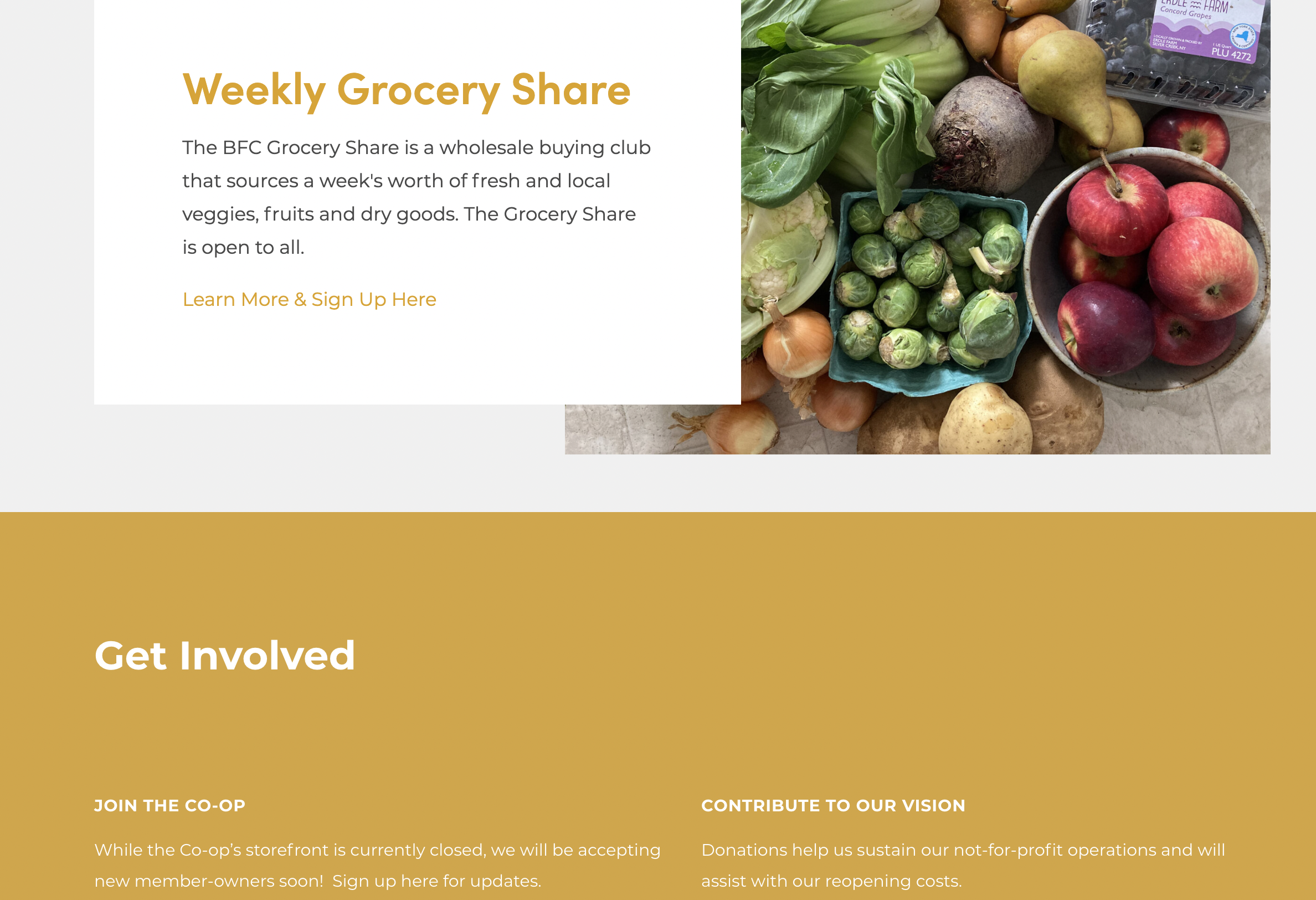
Bloomingfoods Co-Op
Pro: Product scan option enabled in the search bar, easy to add groceries to cart, breakdown of shopping cart is nice & makes it easy to double check, pick-up timetable lets the user feel in control.
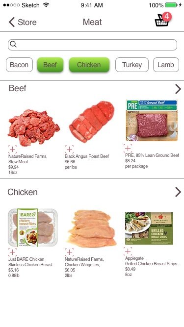
Con: Stock images of categories are a bit distracting, “customers also bought” function when viewing item seem disconnected… better if they were accompanying items ex: cereal = milk, bread= butter/deli meat
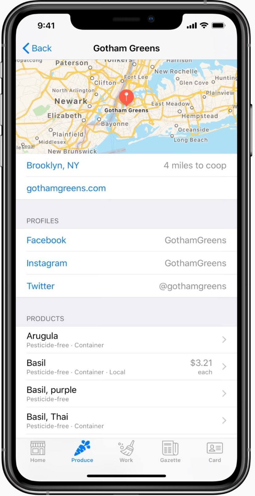
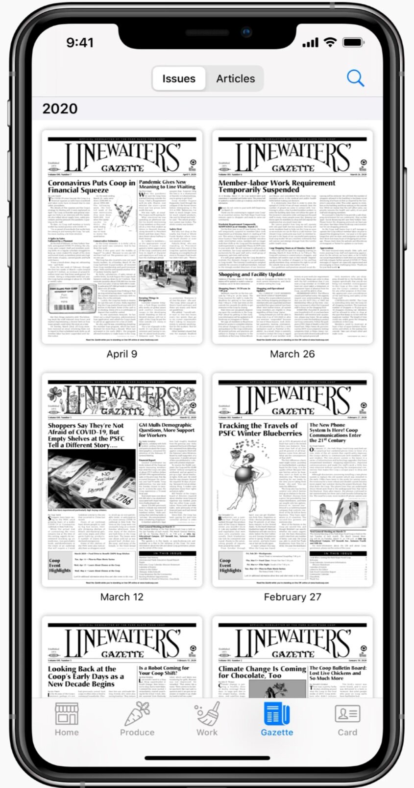
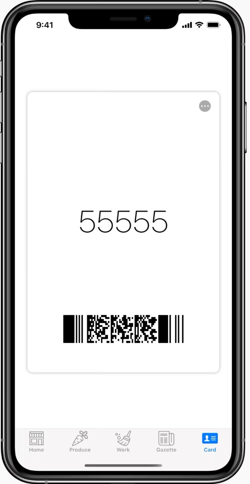
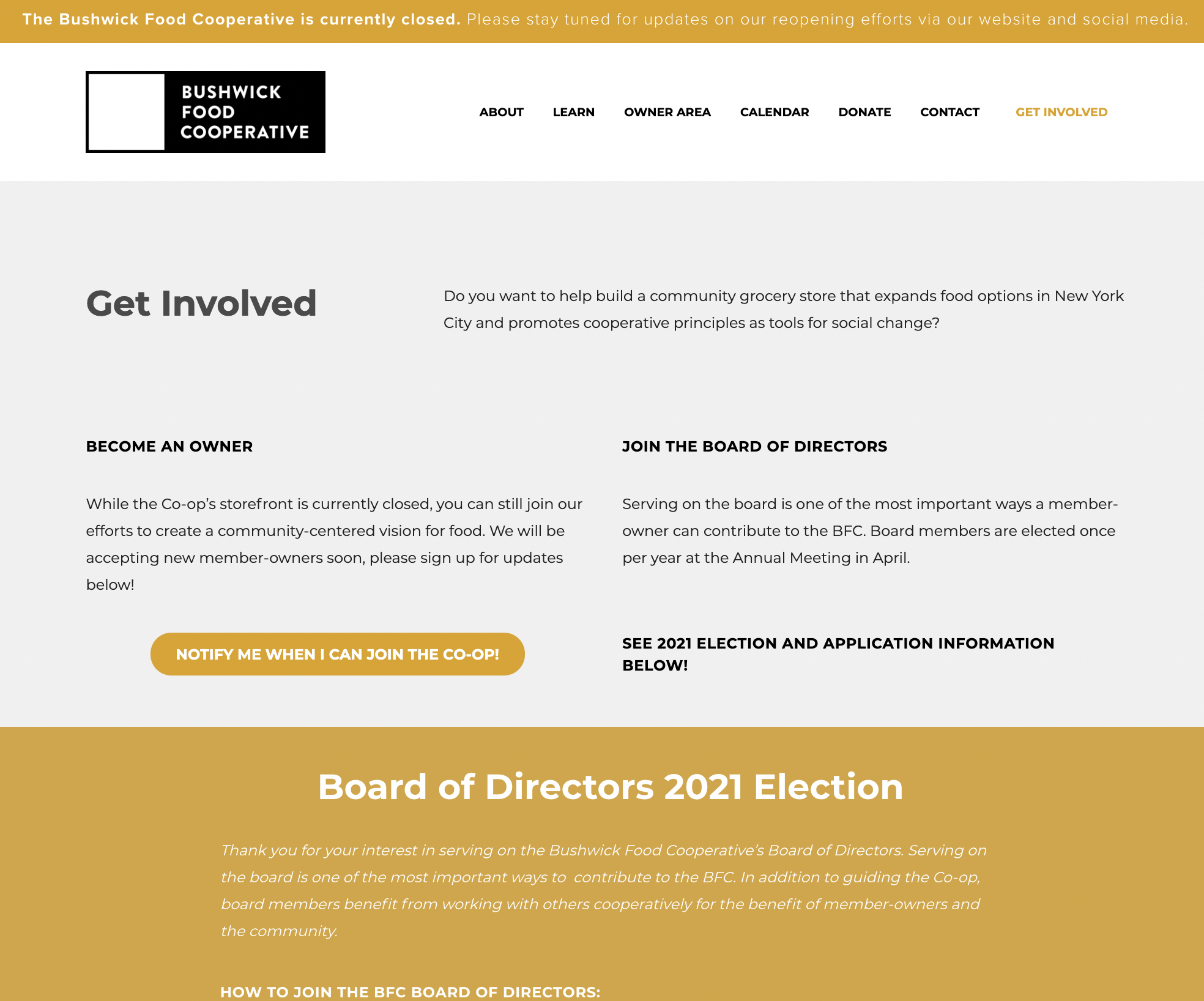
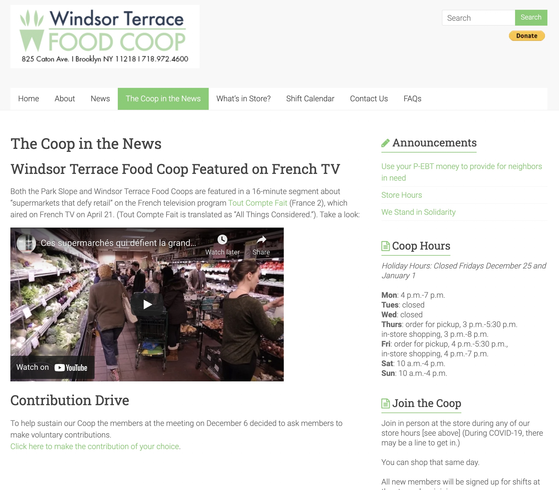
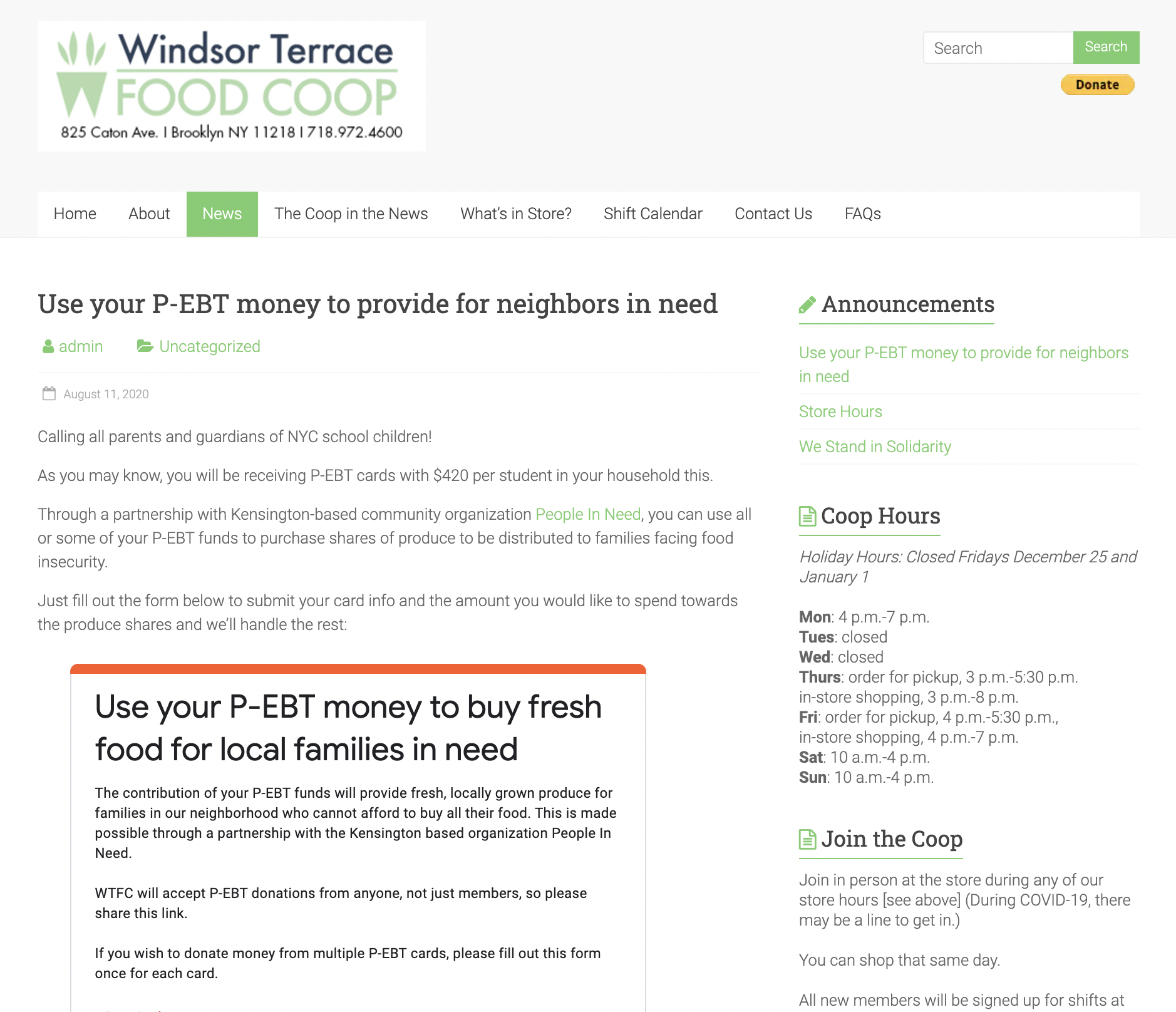
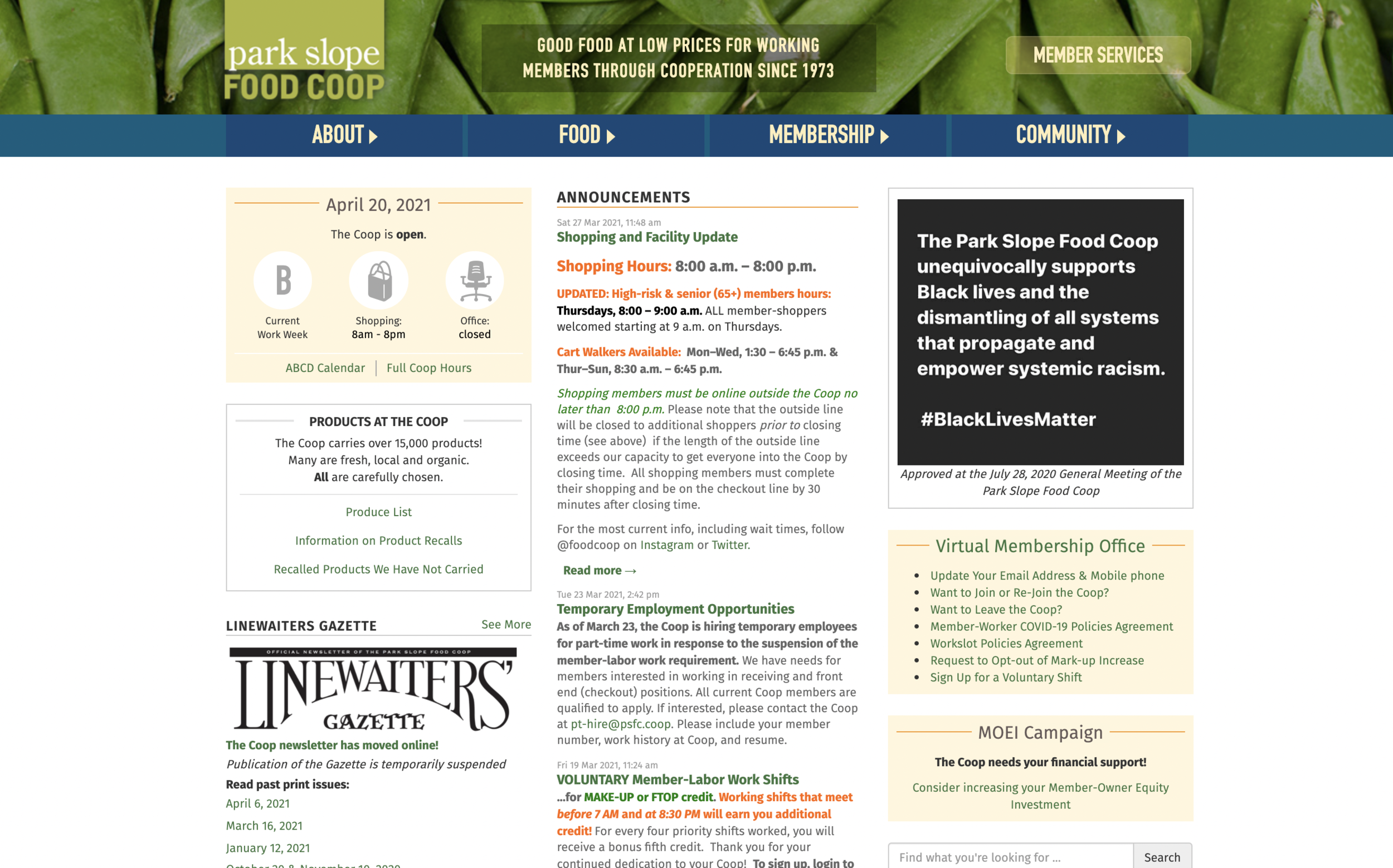
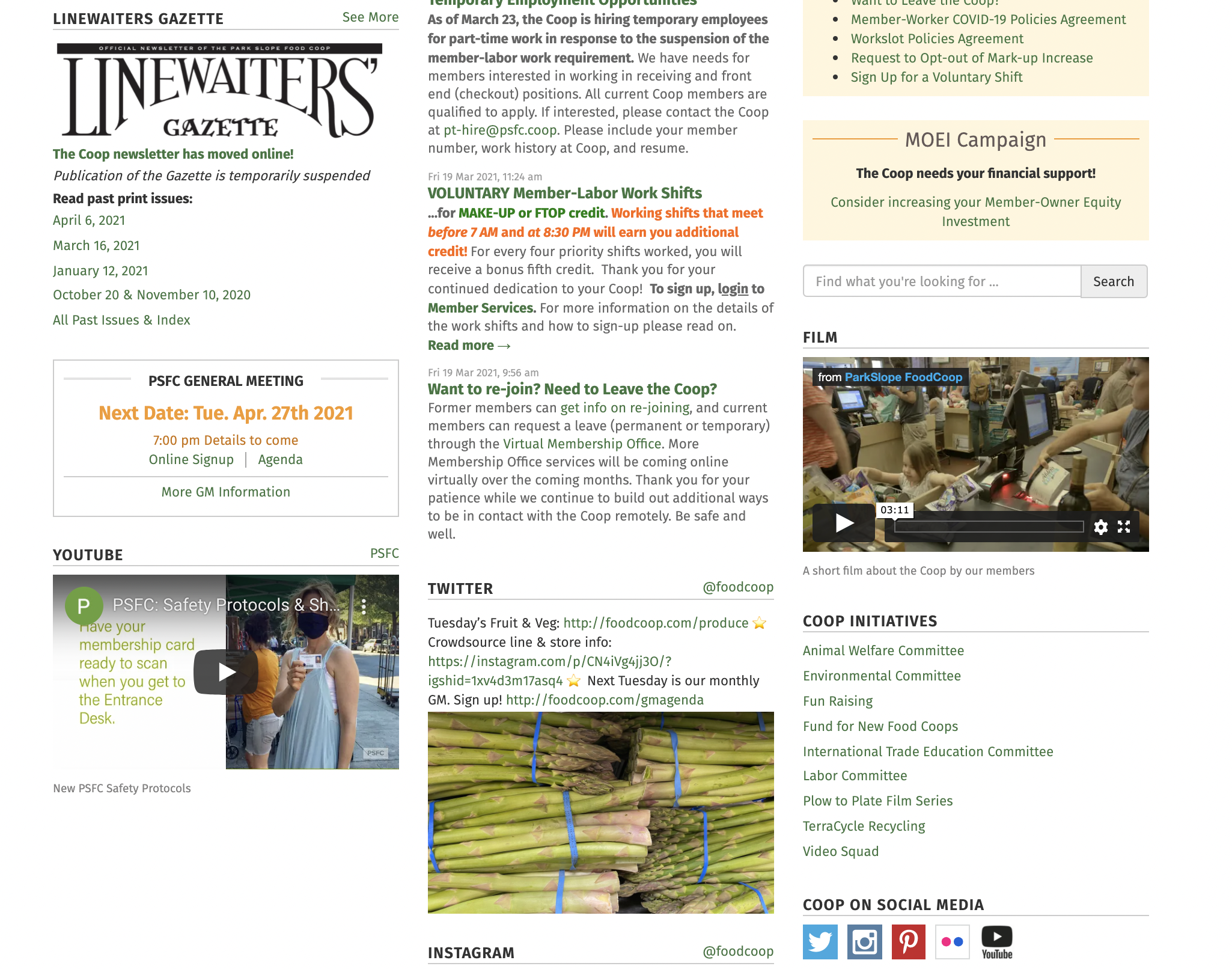
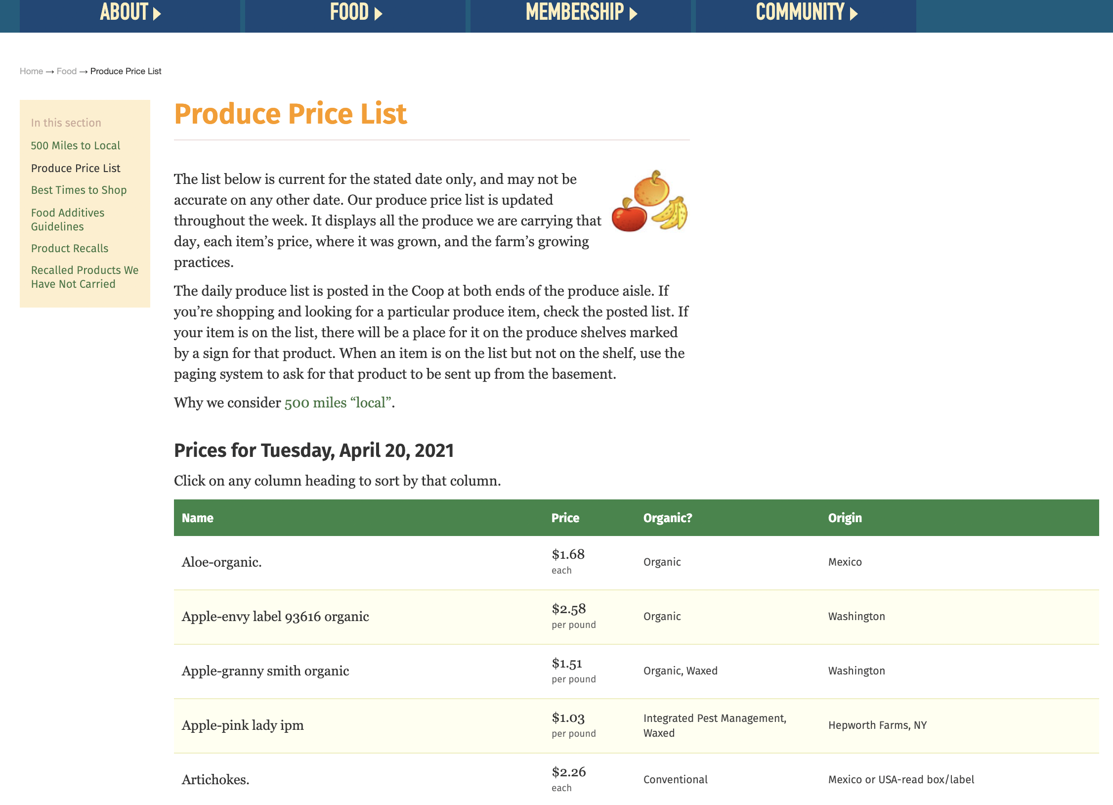
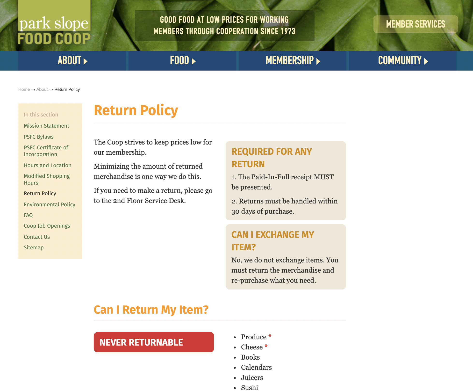
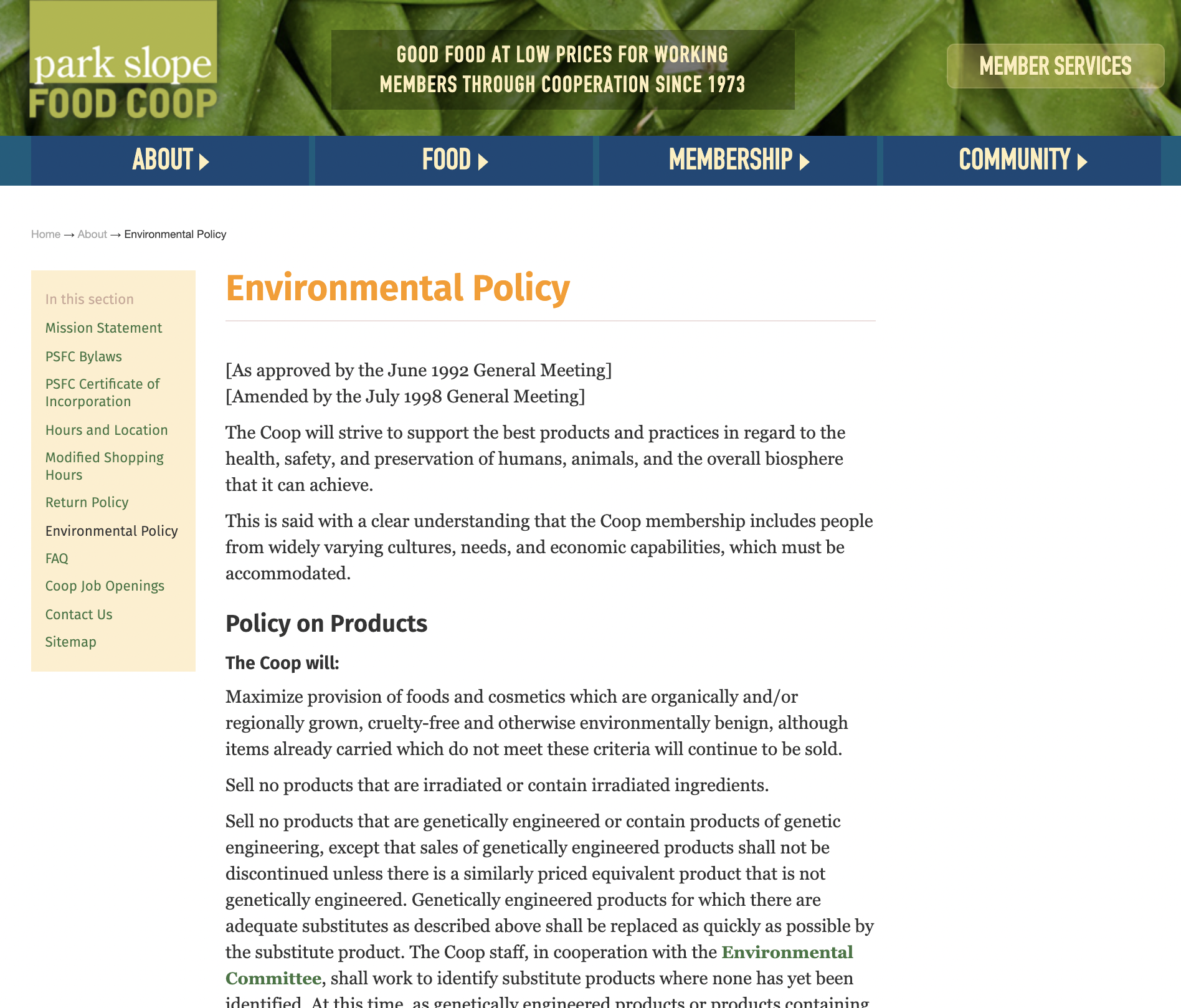
Park Slope Food Co-Op
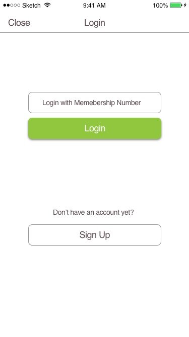
Pro: The app is way better than their website! Transparency of pricing & local vendors is great! A great way to connect with the community. Also a membership code for quick checkout.
Con: Not easy to read archived past issues of co-op gazette (better on web), frequency of new arrival notifications.
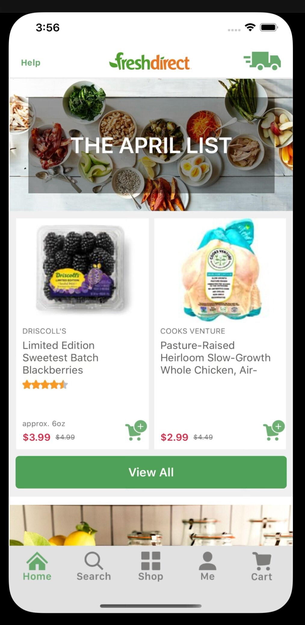
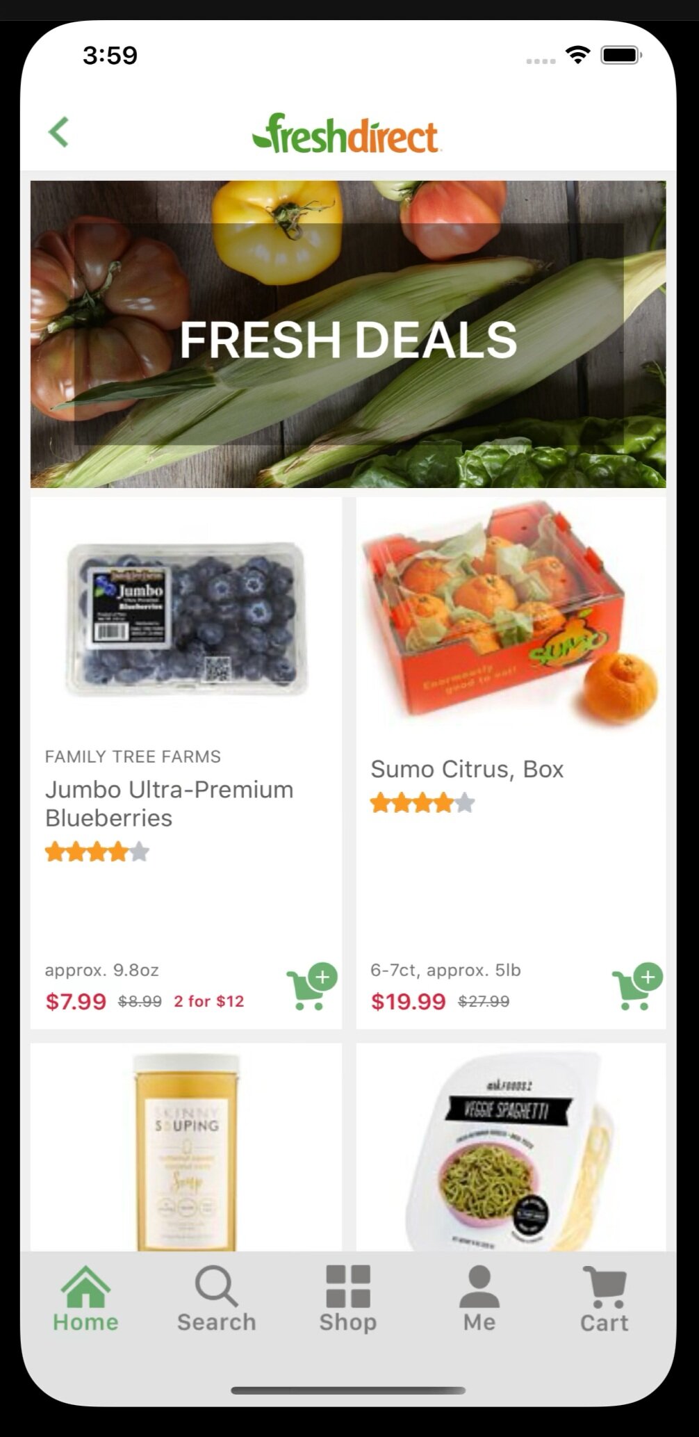
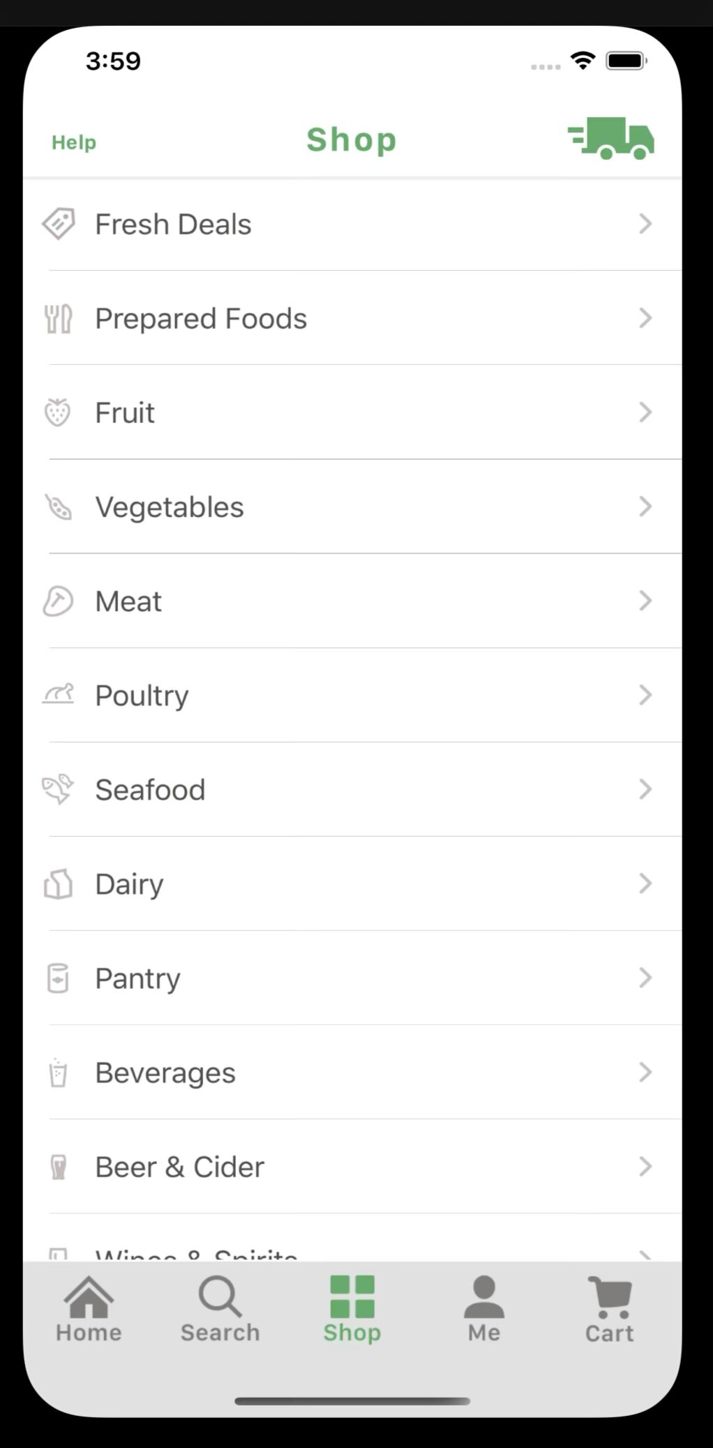
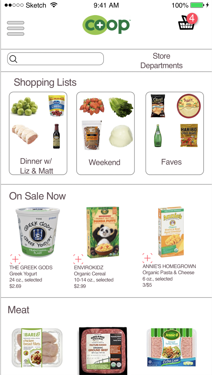
FreshDirect
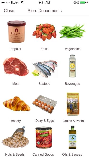
App looks & feels more up-to-date than website. Home page displays current sales, shop guide has easy to navigate departments, items are large, clearly marked & easy to add to shopping cart quickly, if clicked on specific item lots of information is provided.
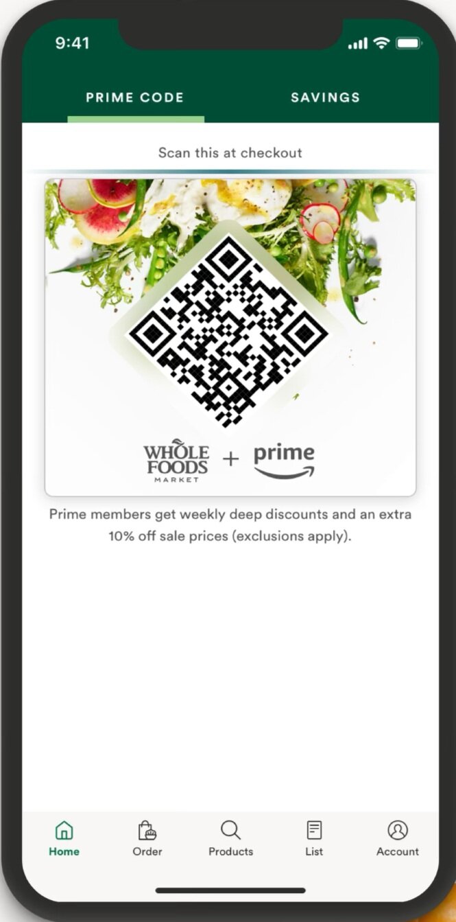
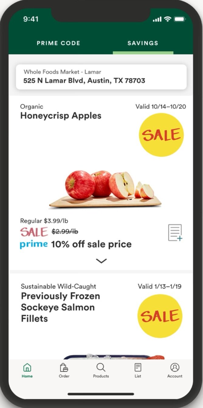
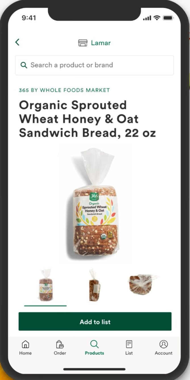
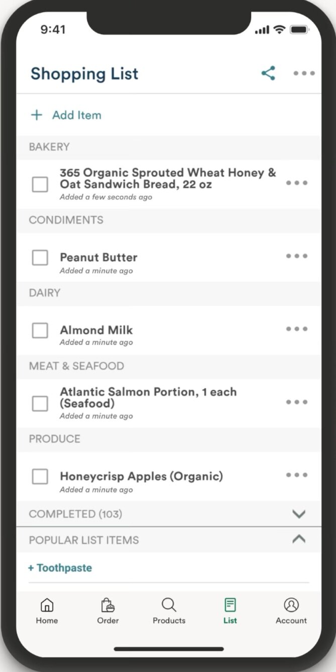
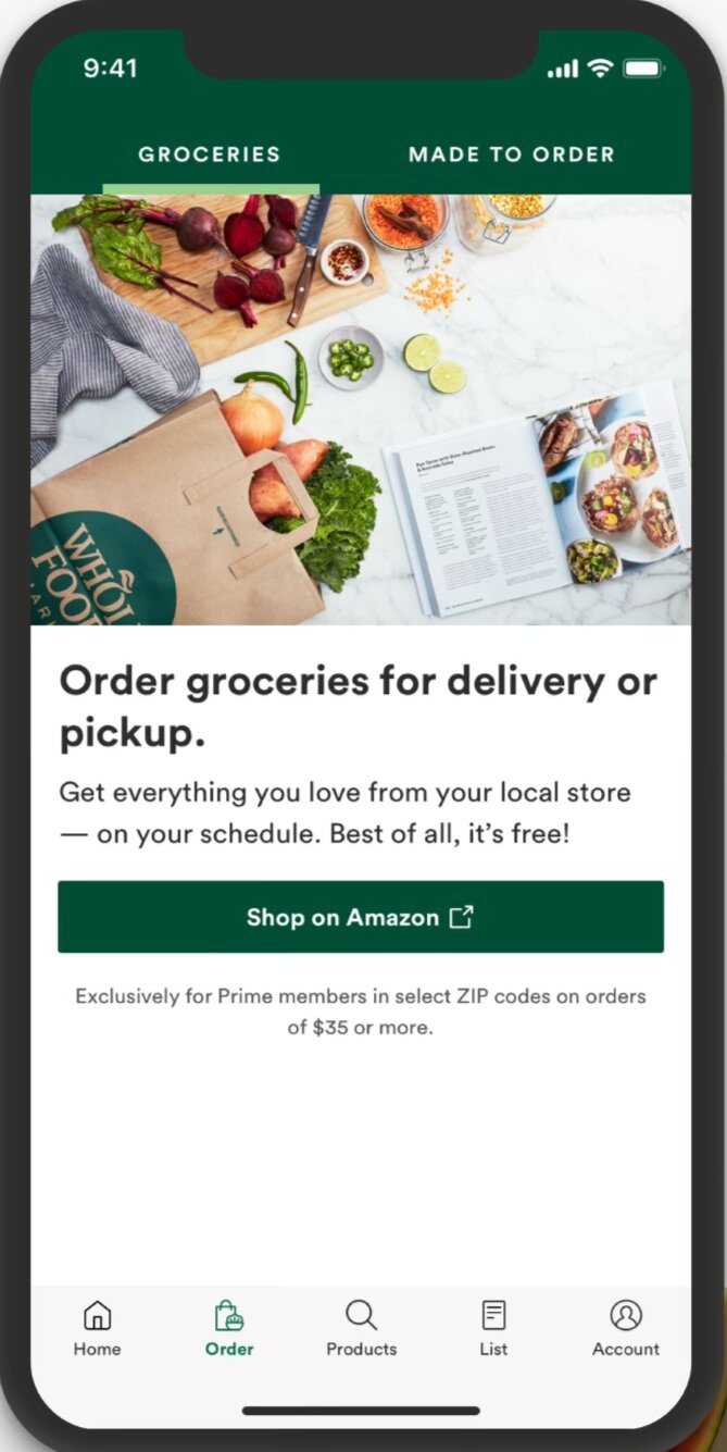
Whole Foods
Very on-brand. I like the tabs on top for quick access. Code for member checkout, browse weekly store sales, clear labels in search, filter products & add to shopping list, free grocery pickup/delivery, order ready-to-eat food for pickup/delivery.
Empathy Map & Persona
Over 3 weekends I spent time outside the Co-Op interviewing customers waiting in line to do their grocery shopping. After I was able to get a general sense of the local customer base & created my persona: Amy Williamson.
Insights
Customers uncomfortable or anxious in line & shopping
Customers are looking for other shopping options
Needs
Customers want a safer & quicker way to do their shopping
Customers want an easy way to know if items are in stock
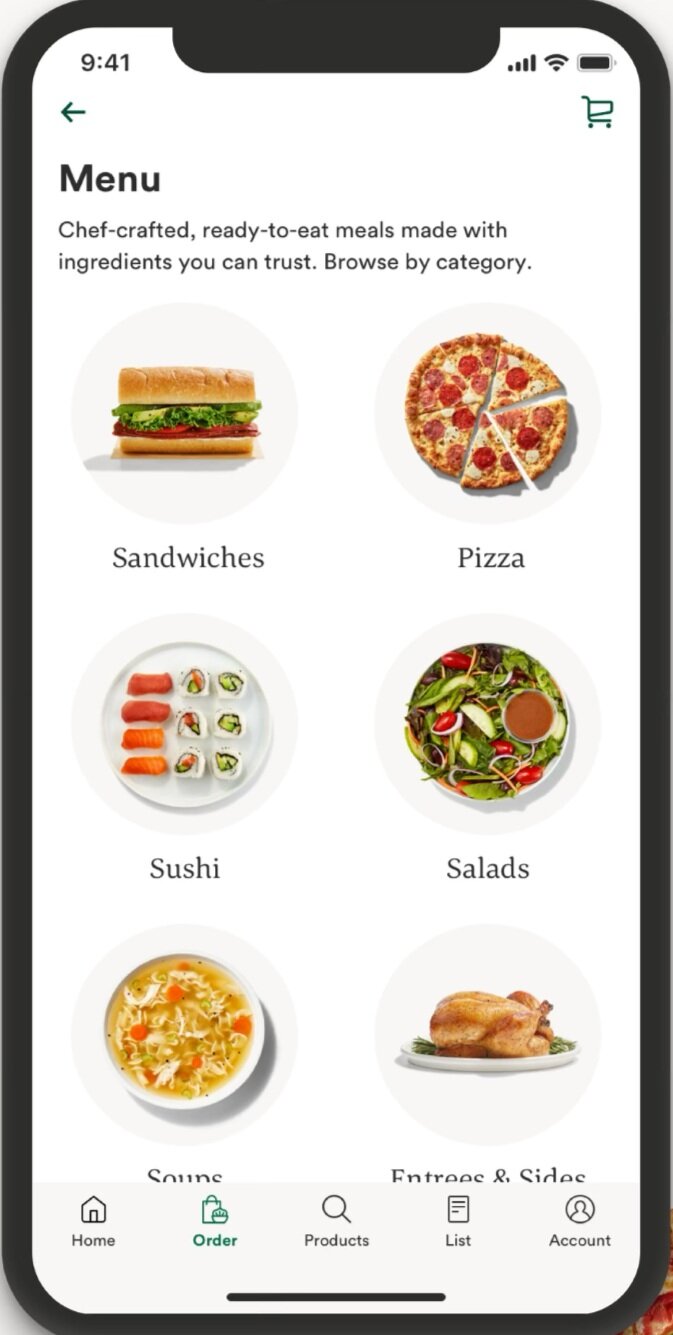
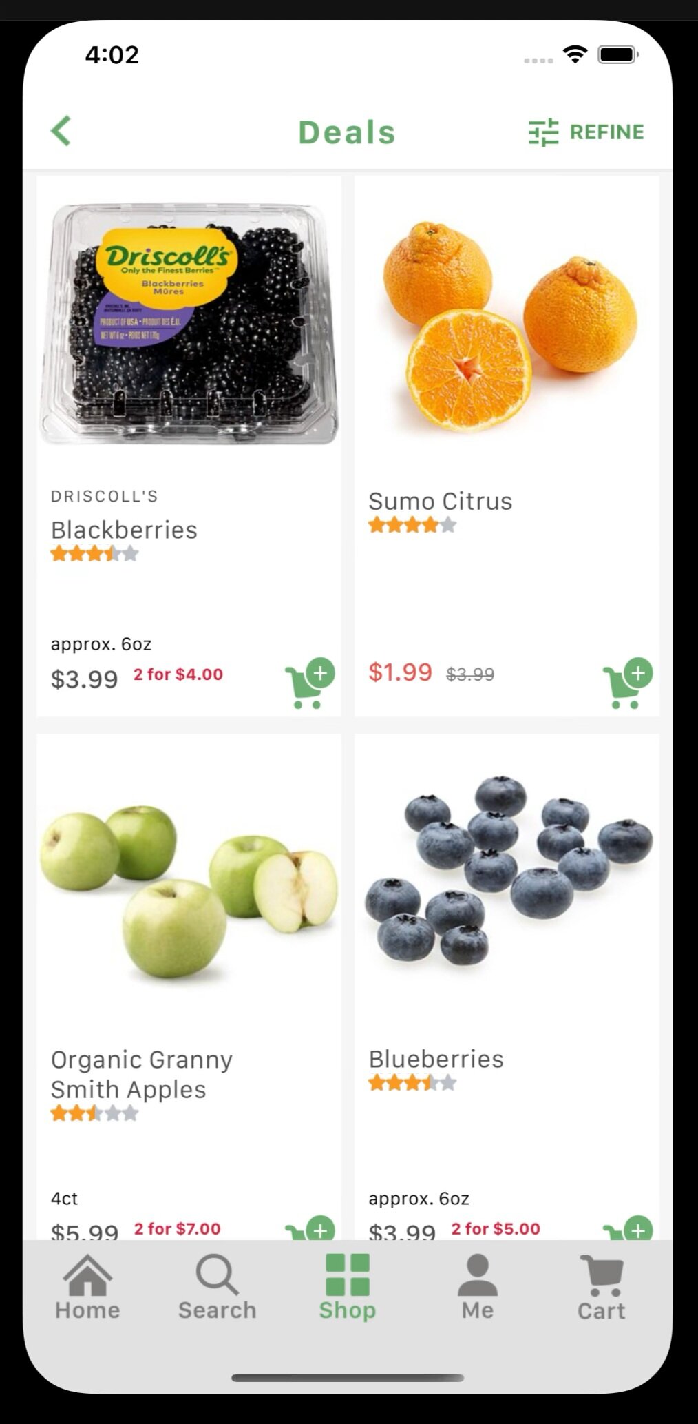
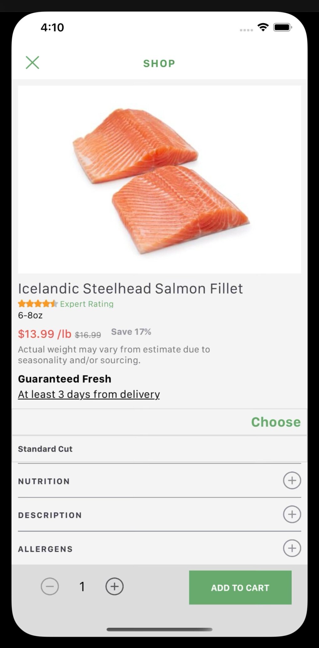
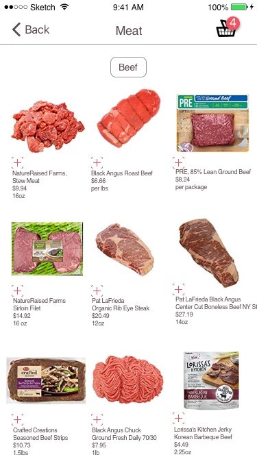
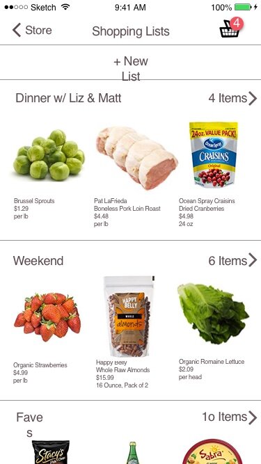
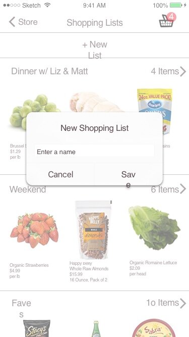
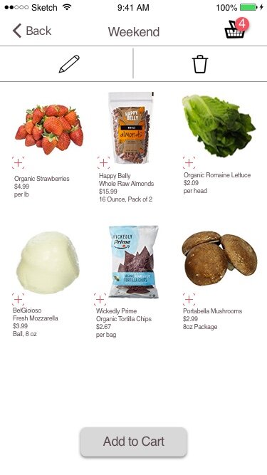
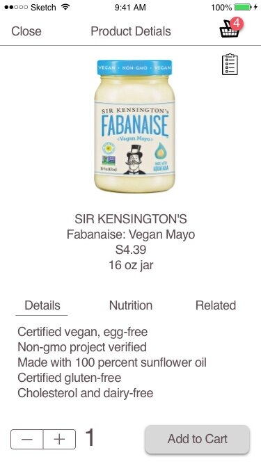
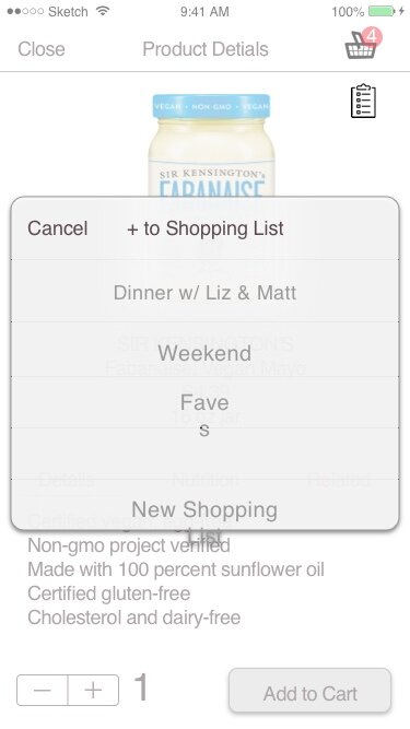
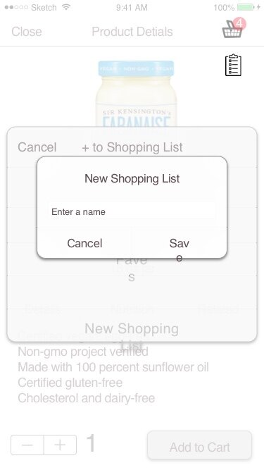
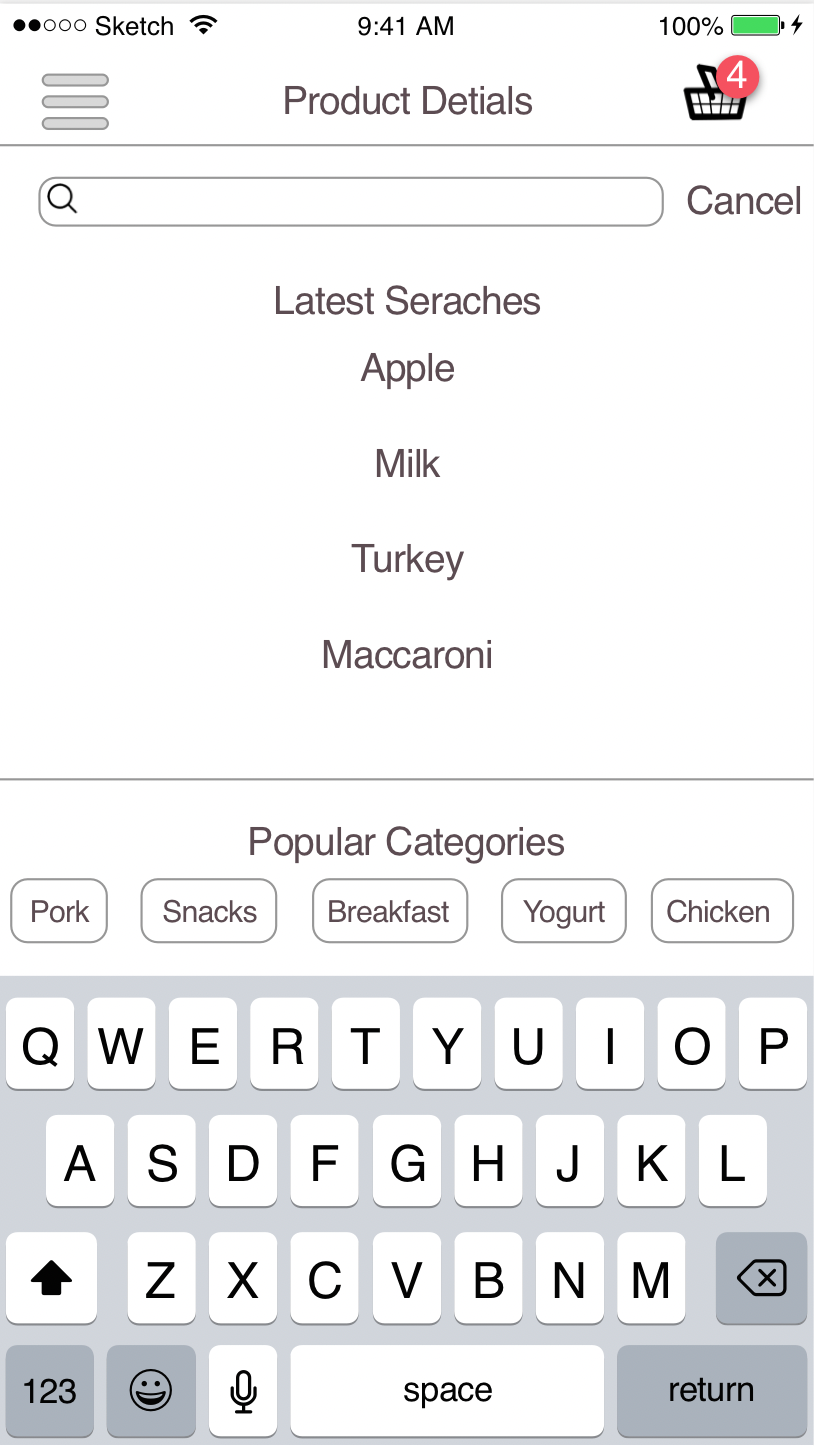
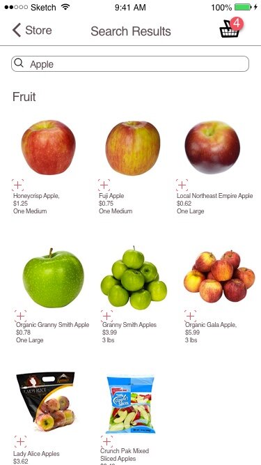
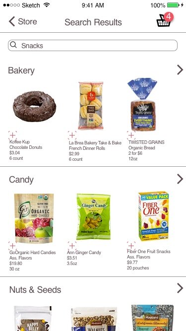
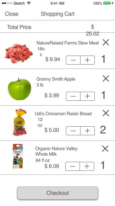
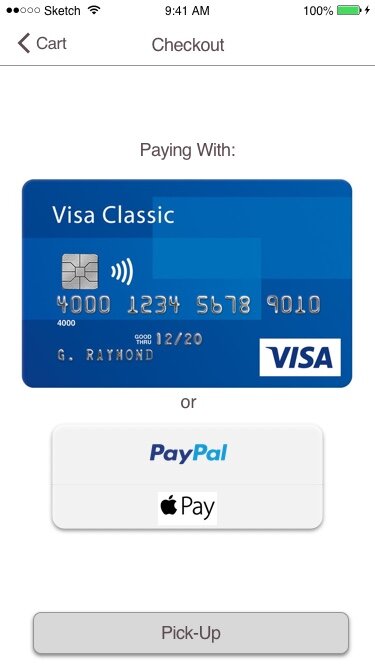
mid-fidelity Wireframes


High fidelity Mock-ups
The website
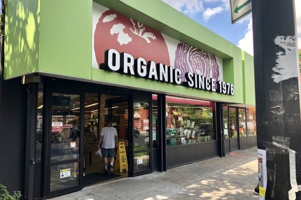
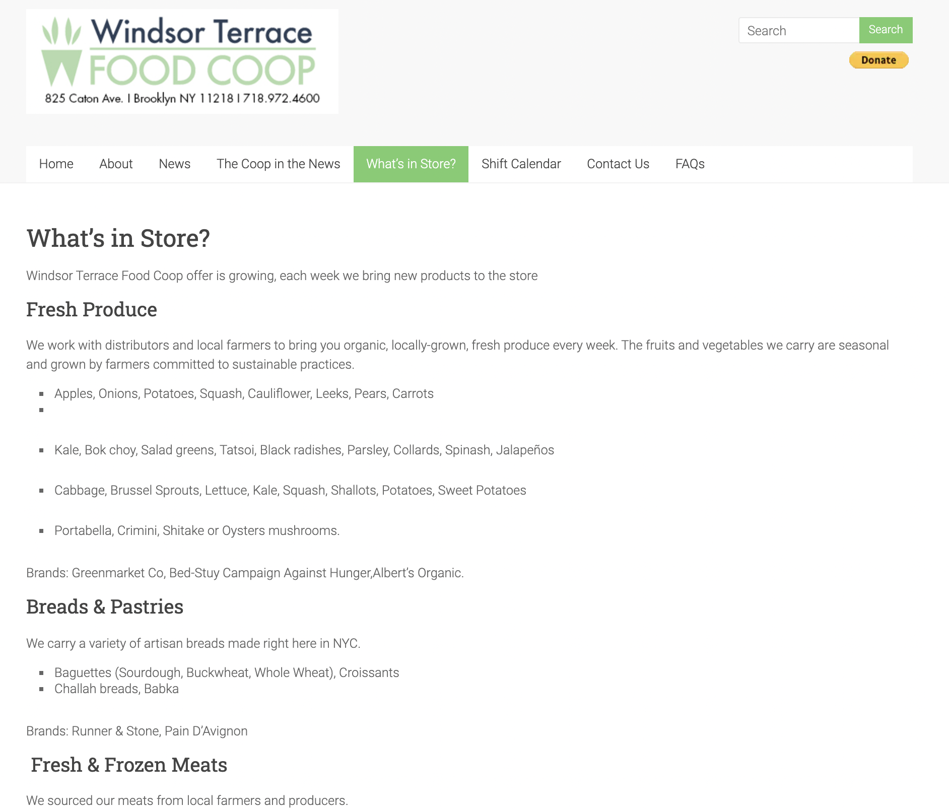
The current Flatbush Co-Op website is very 1996 “local chamber of commerce” vibes. If I was going to build an app that better reflected the times & was succinct with the recently updated storefront the website needed a facelift as well.
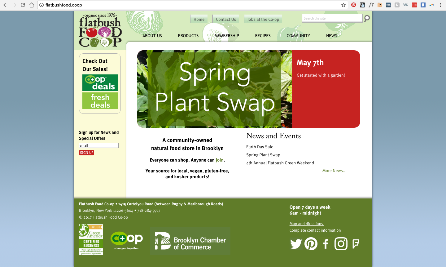
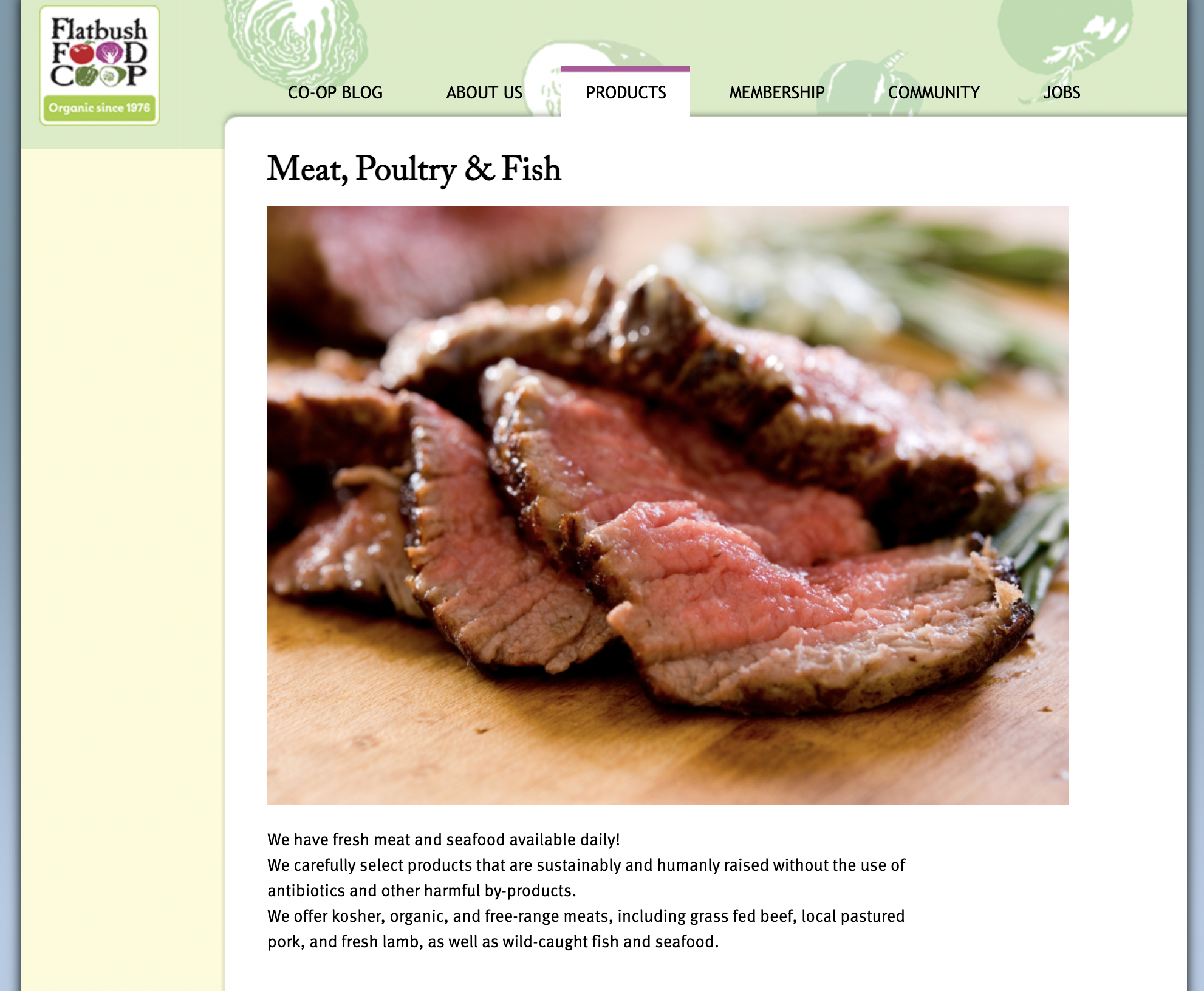
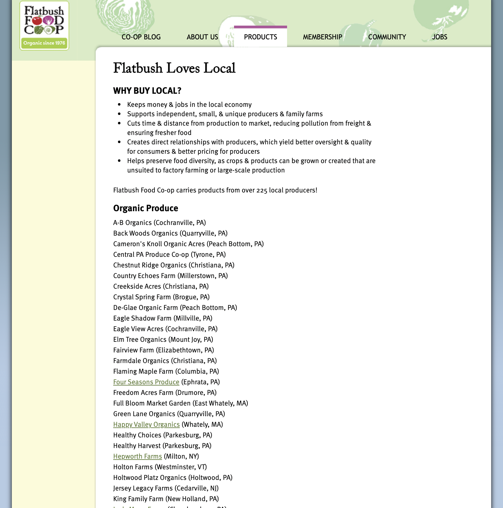
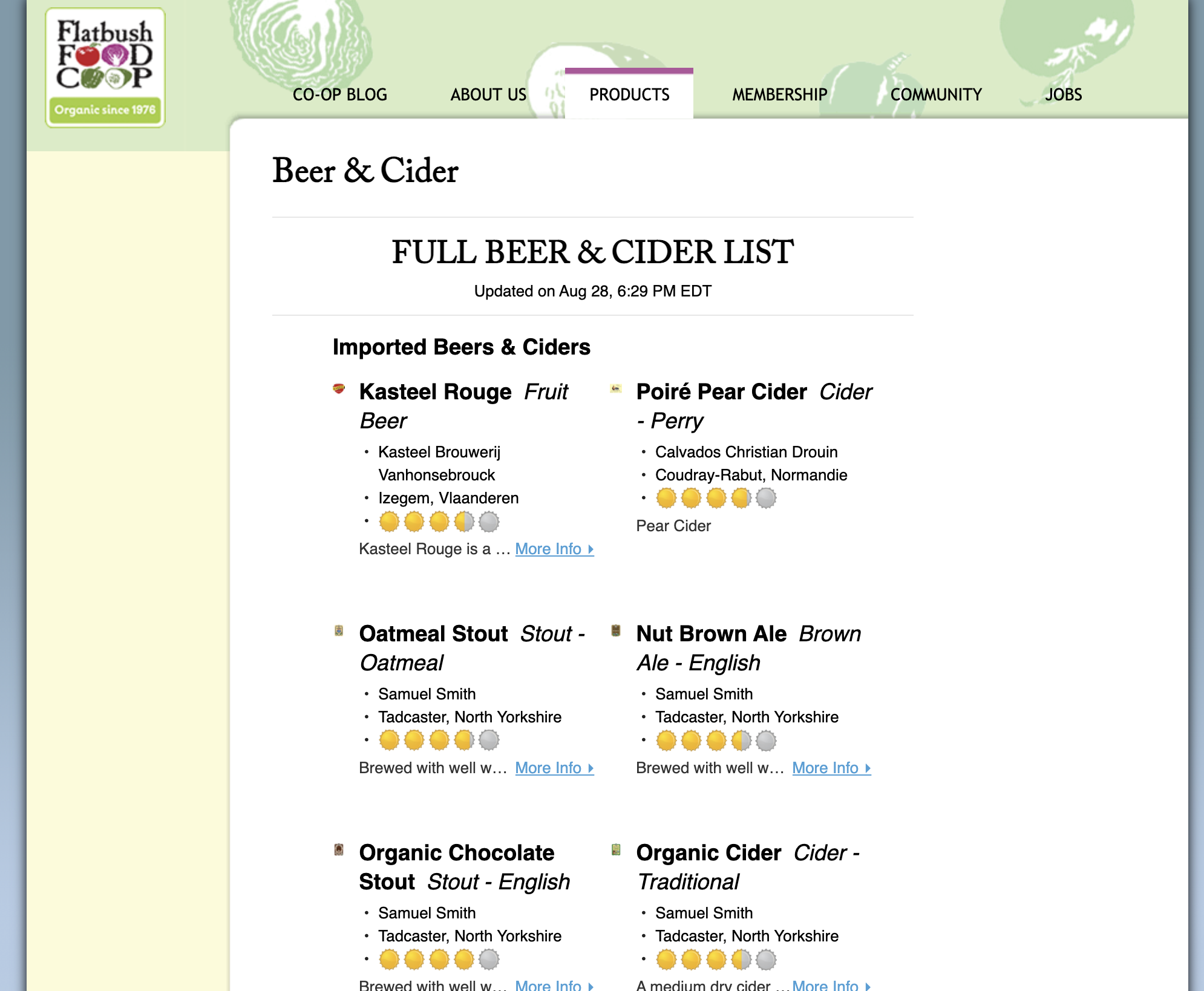
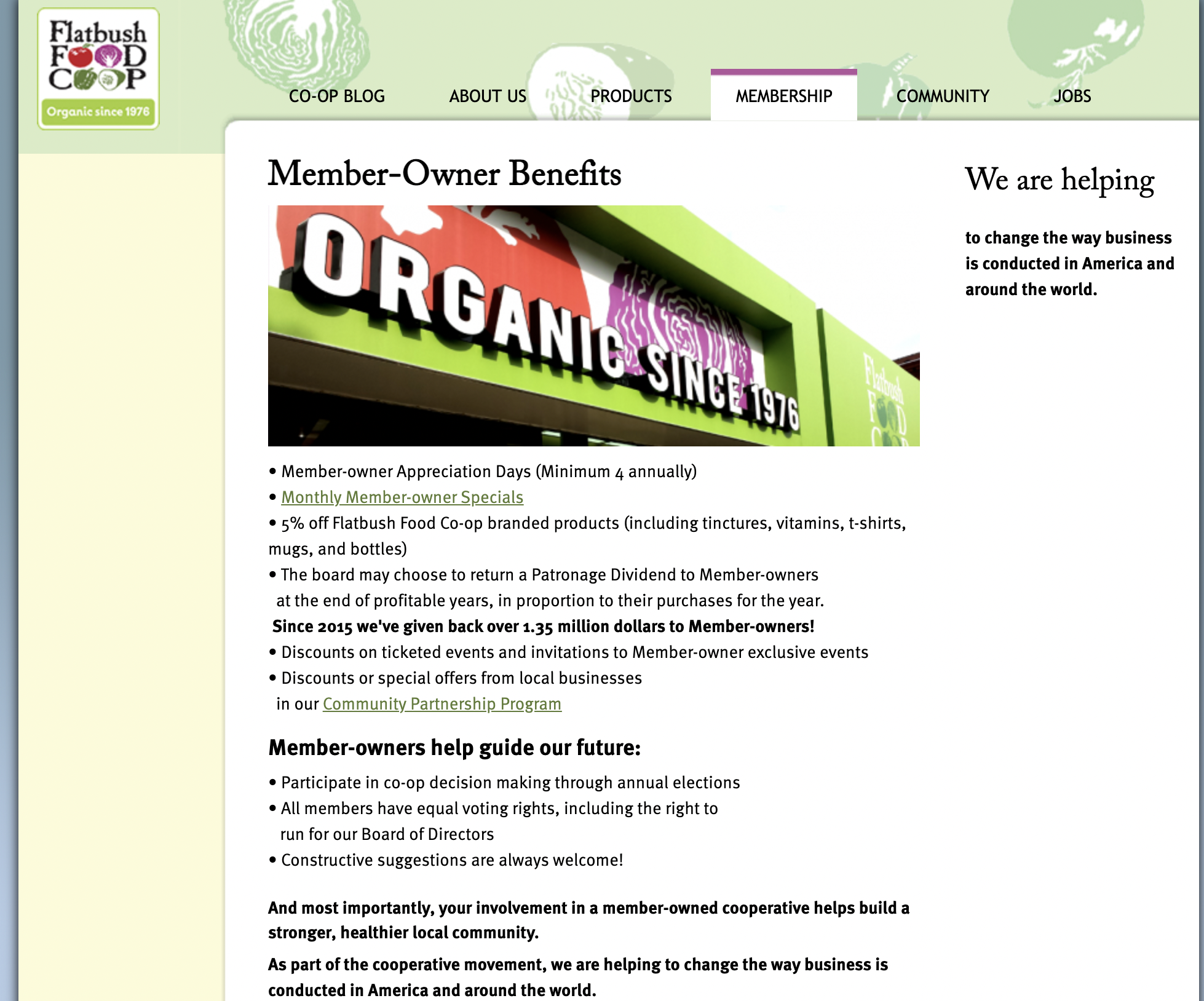
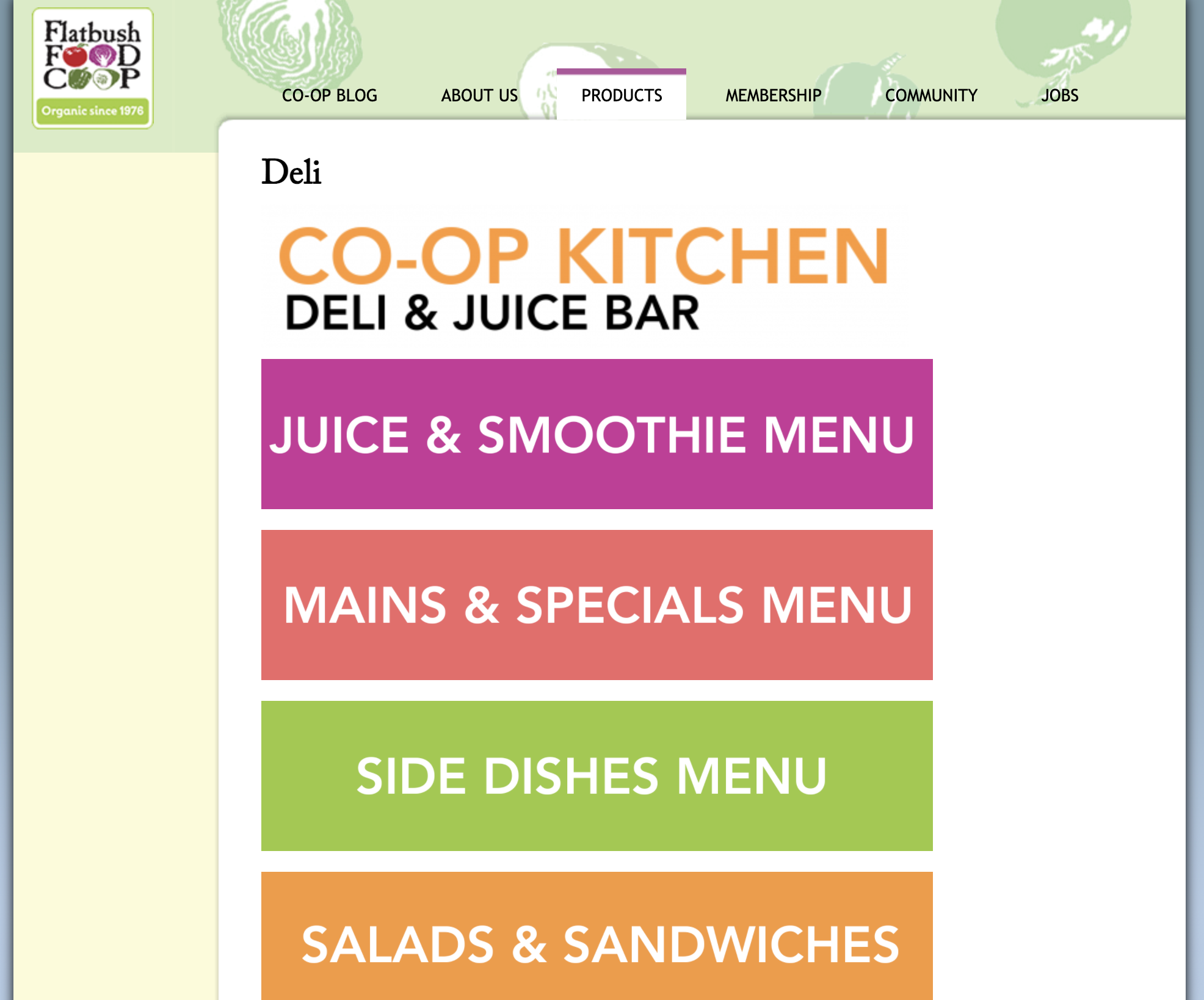
28 pages: text heavy, 3 pictures, 1 video, 6 stock images, + 4 downloadable menus
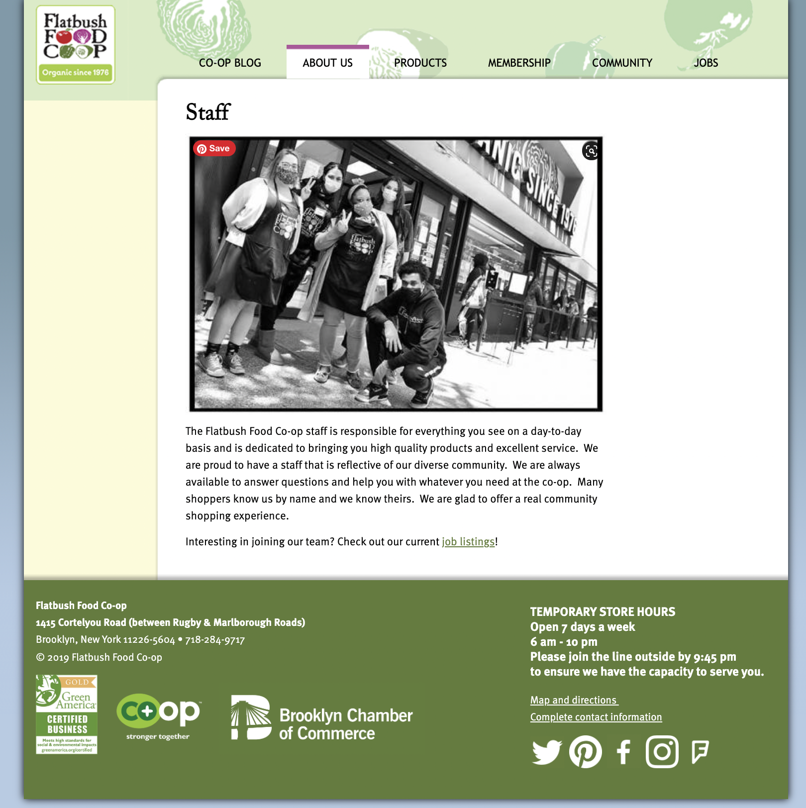
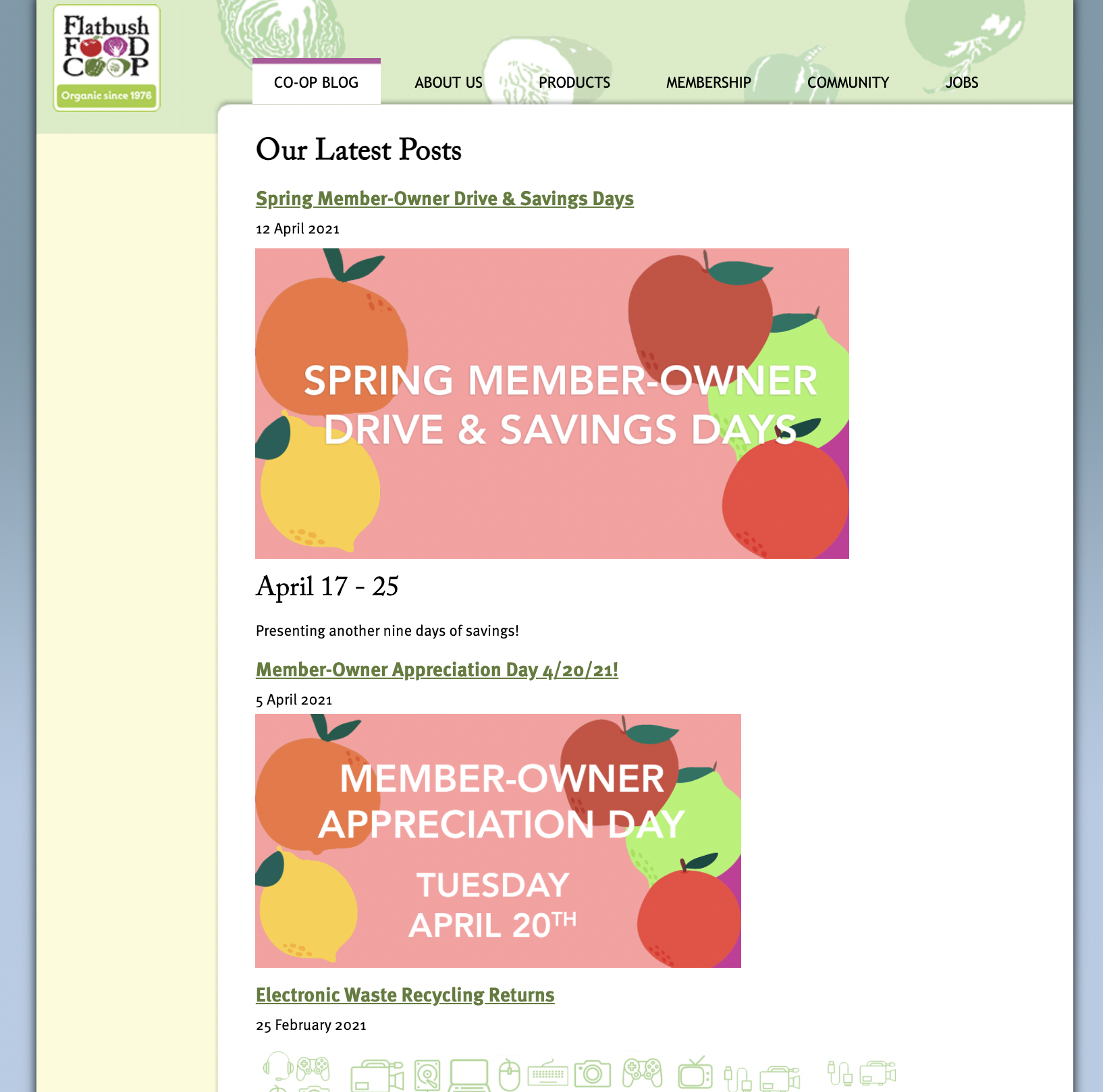
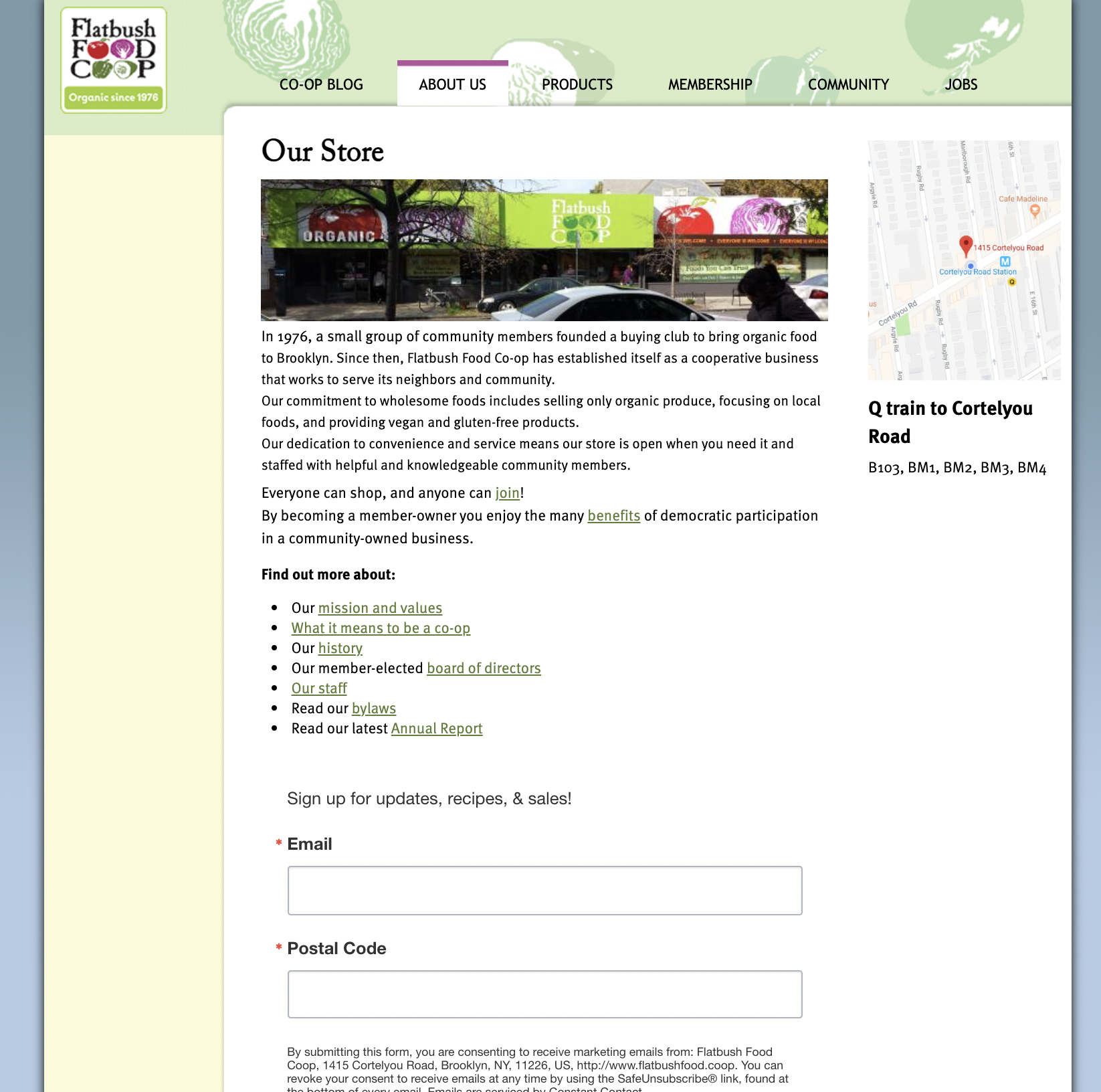
Current Site Map

Competitors
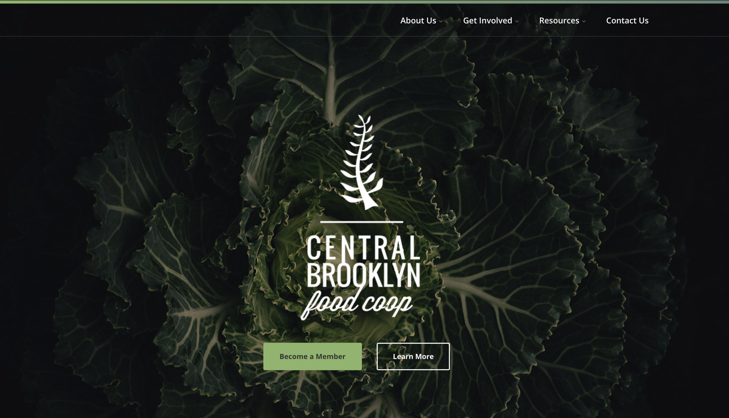
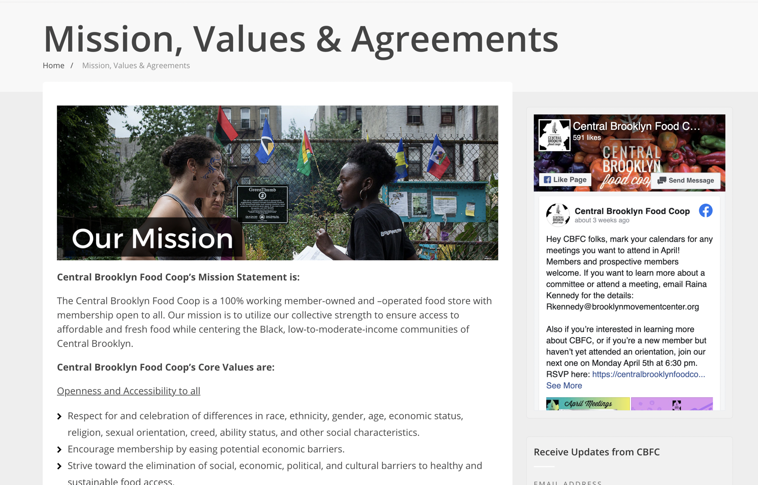
I looked at the websites of other Brooklyn based food co-ops. They all offer varying degrees of the same information but Greene Hill stood out. It is the most dynamic while still keeping the community oriented feeling that Co-Op’s thrive on. The layout is easy to use; full of images & videos to break up the text.
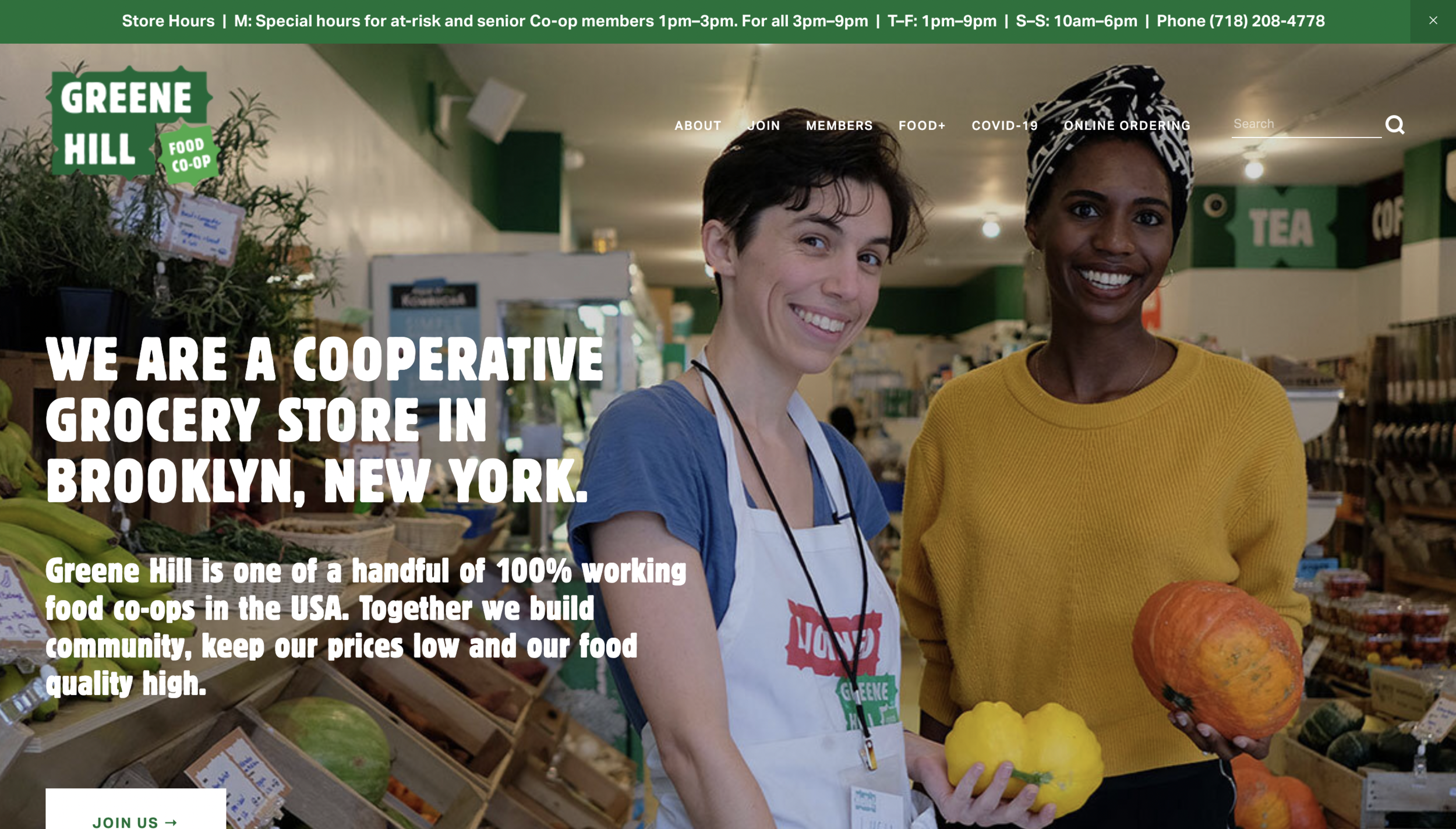
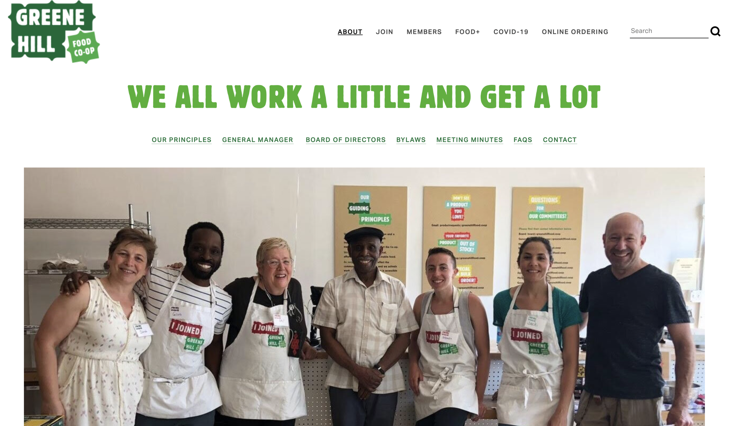
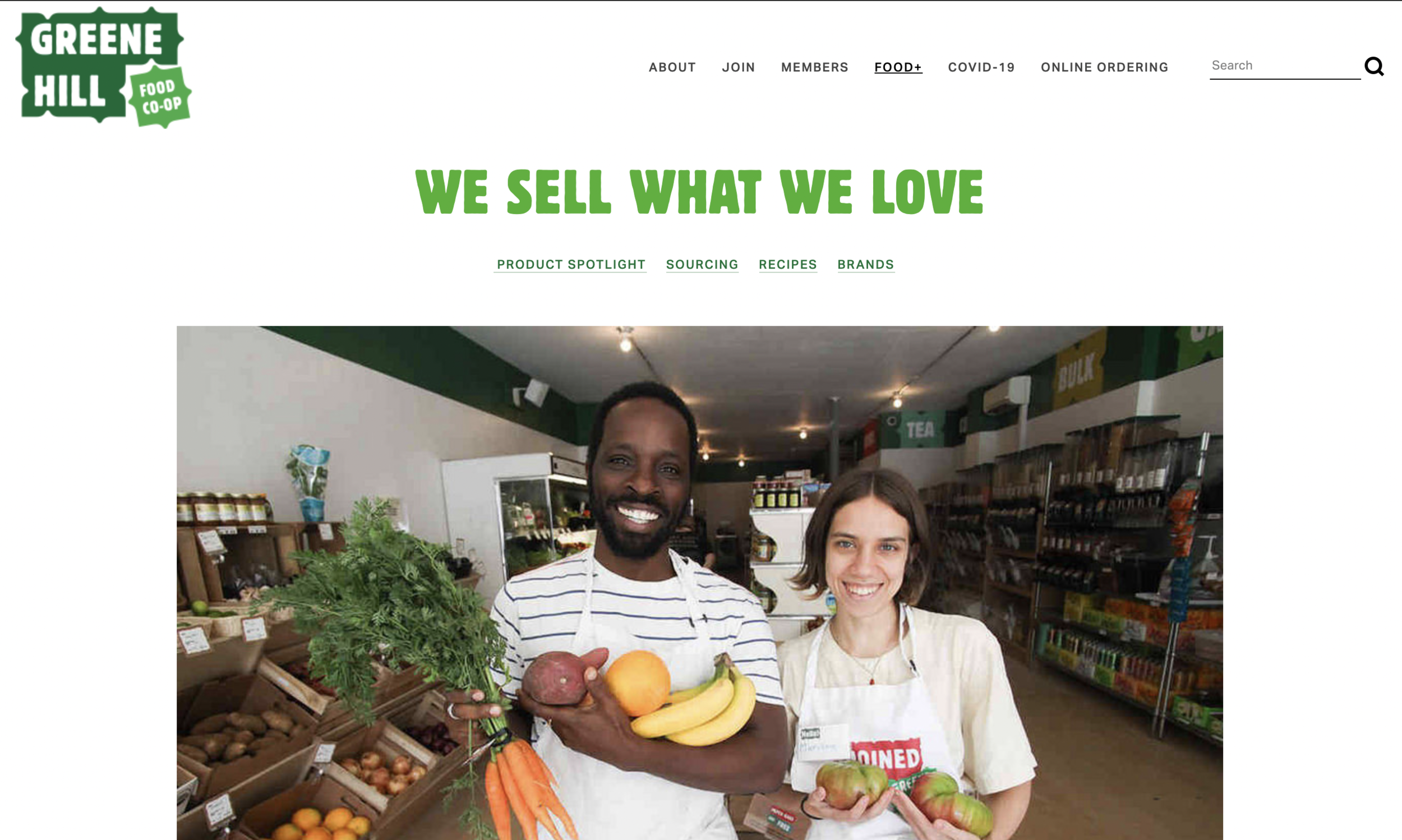
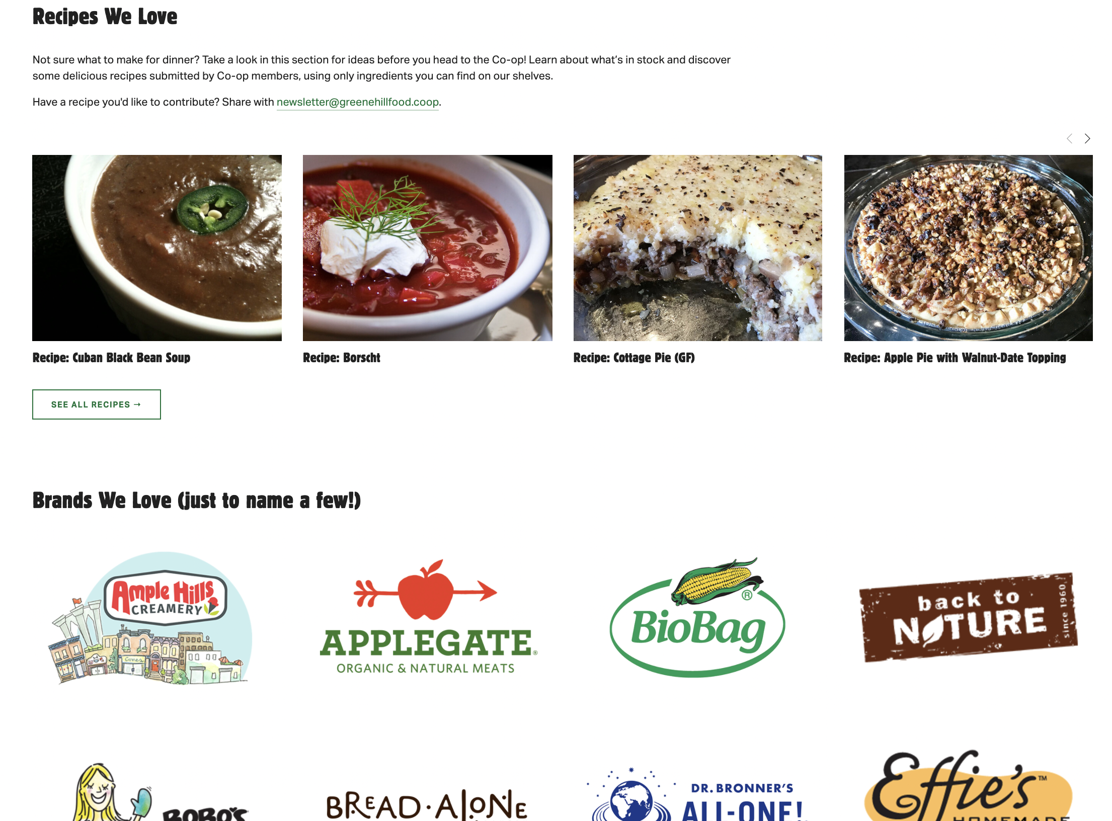
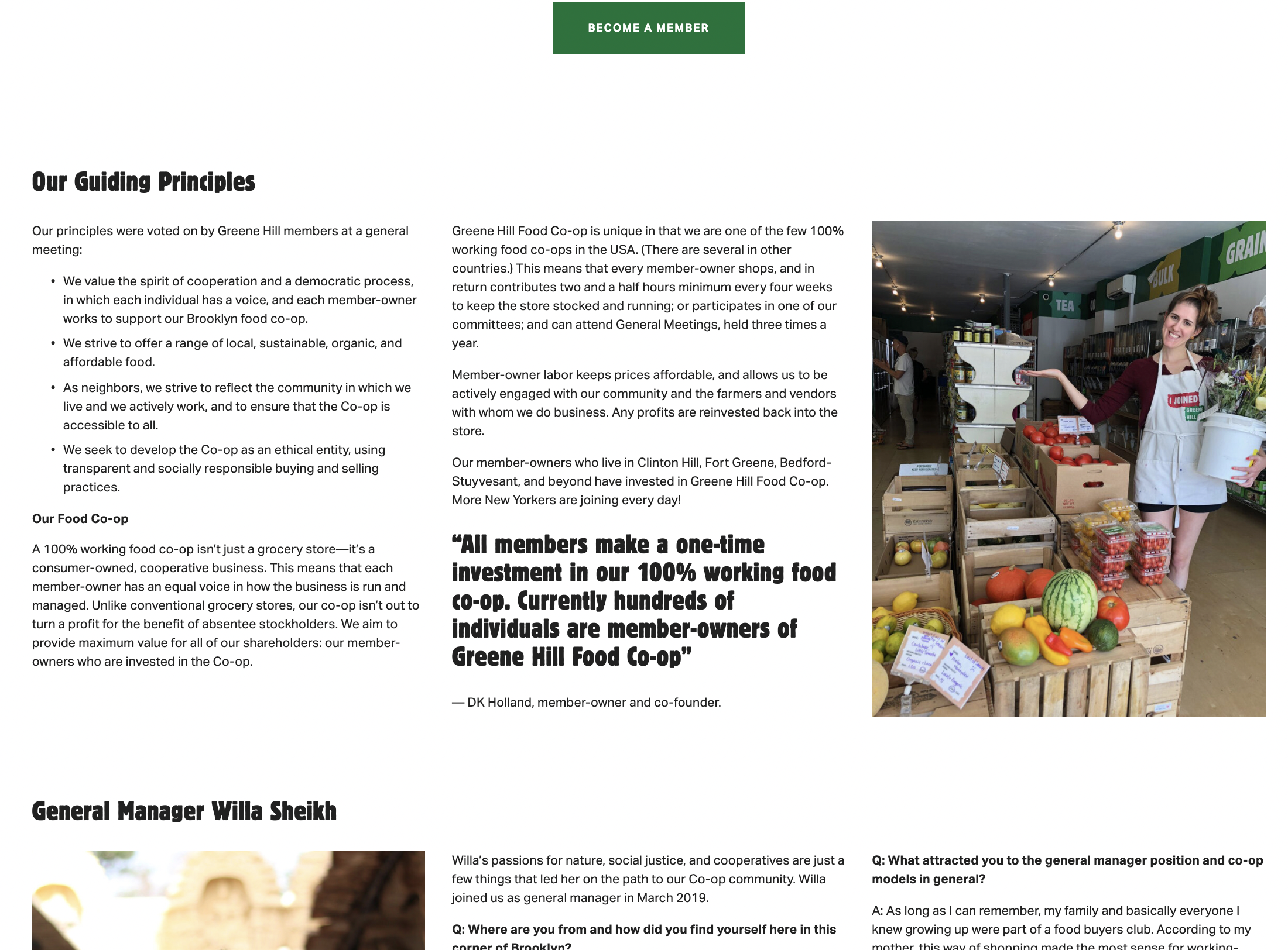
Lots of images on every page, very inviting. Content that shows the co-op is like a family.
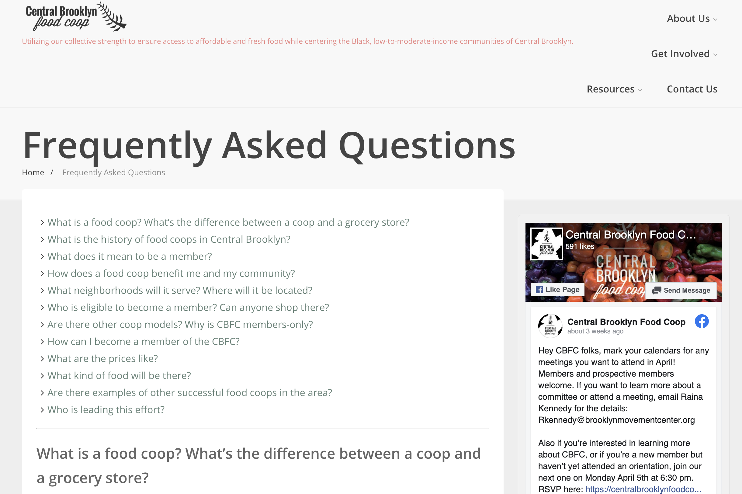
Text heavy, 5 images total. The site might have a lot of information but it is hard to find when it is full of so much words with nothing to easily break it up or draw interest.
Very sleek. Professional images that looks like a Williamsburg marketing firm. Social media is equally on brand.
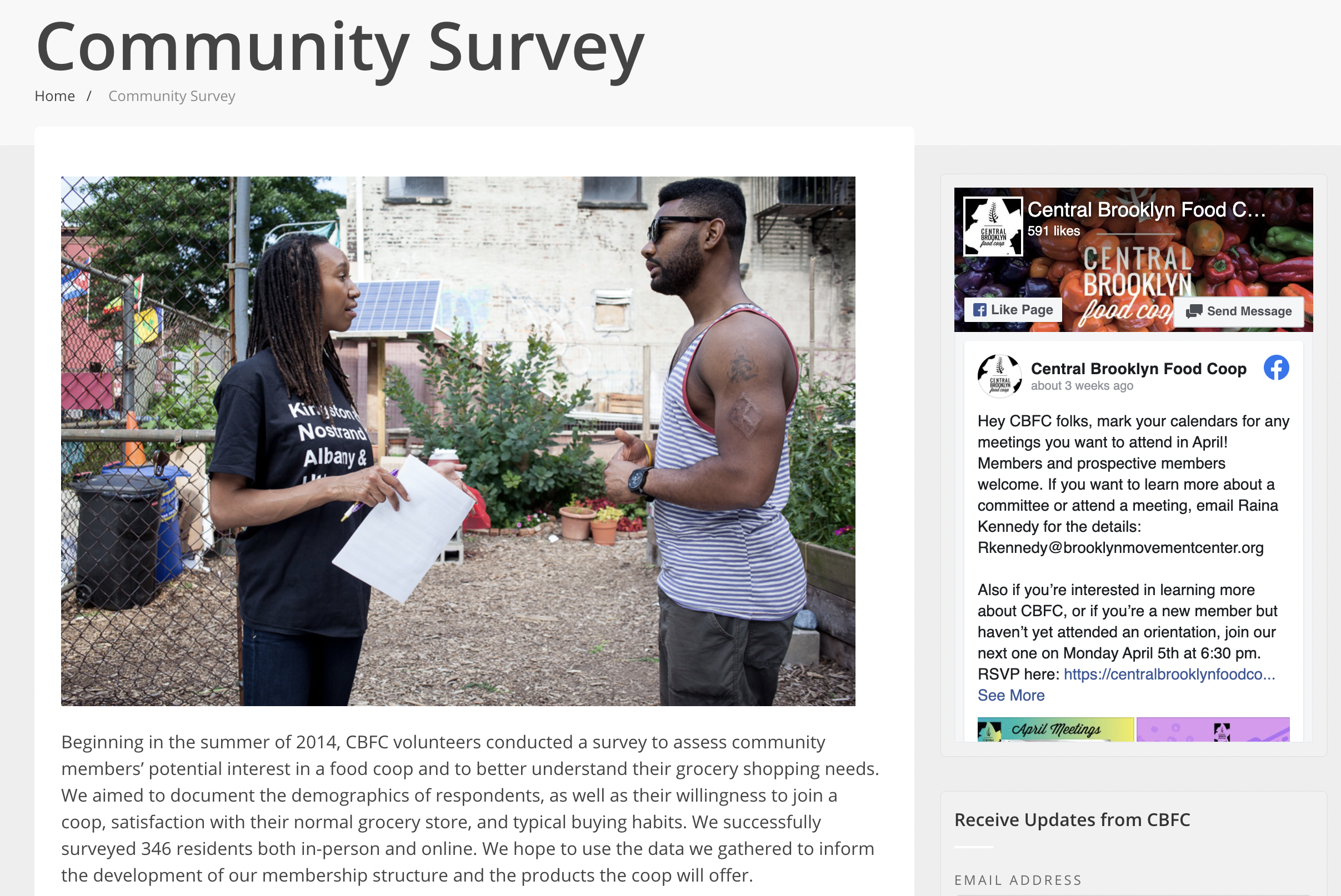
Impressive home page that doesn’t resonate with the rest of the website. Not focused in its messaging & the same info is on multiple pages + menu isn’t lined up properly.
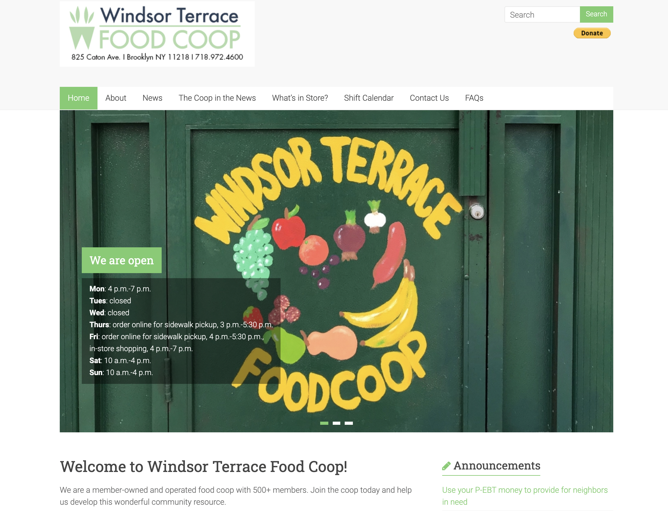
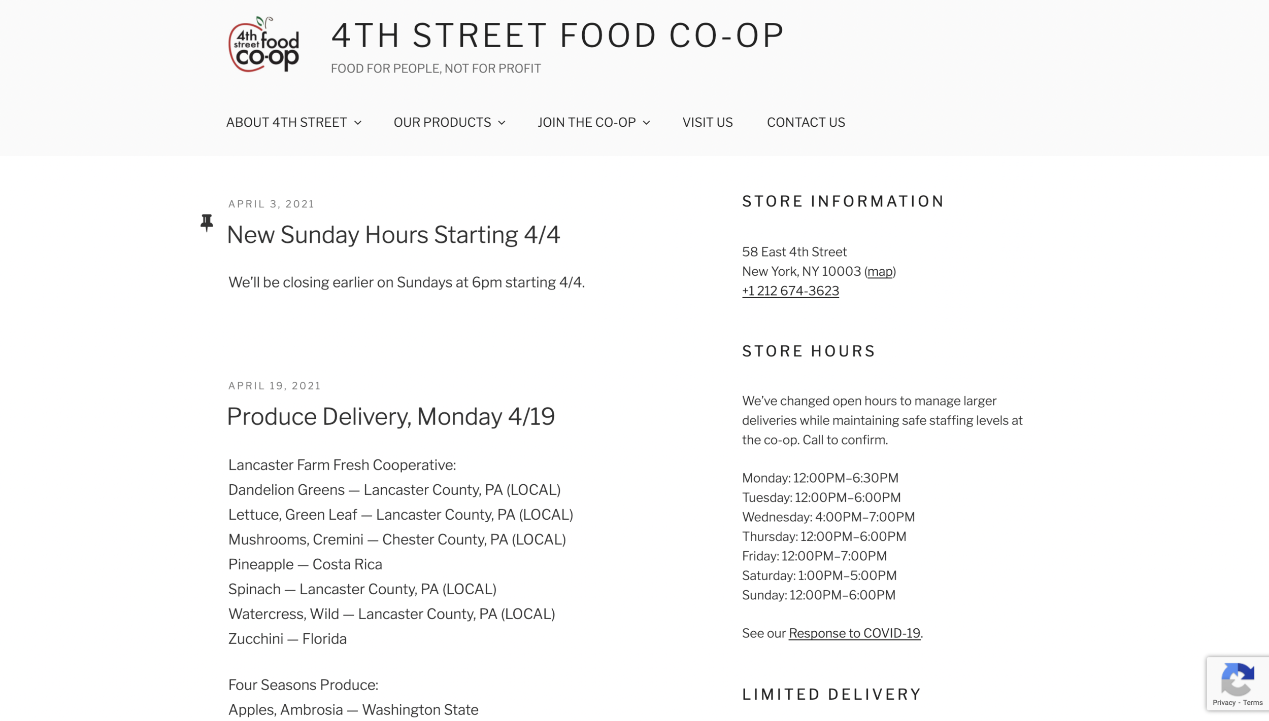
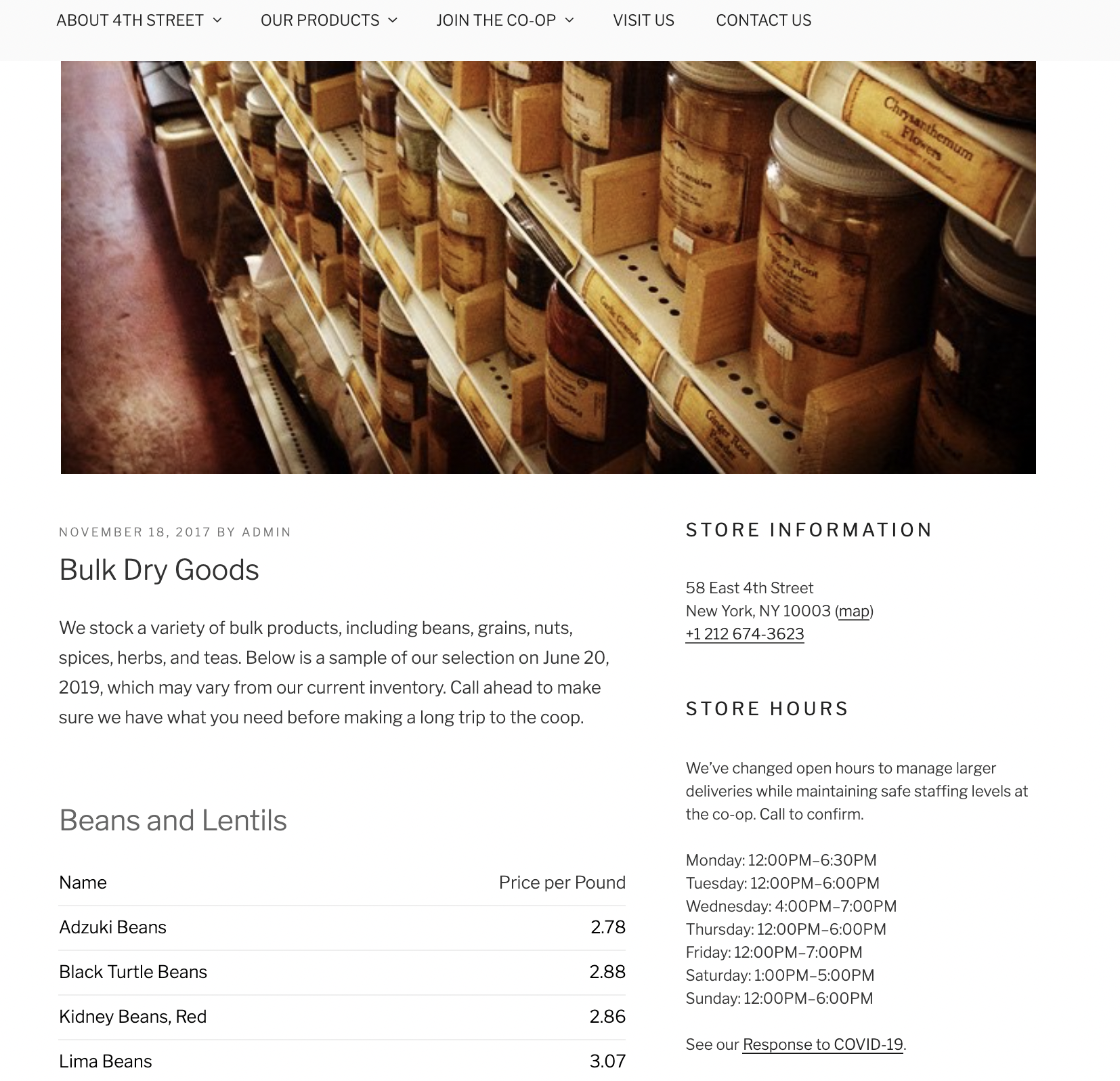
only 3 images as slideshow on main page & 1 video in French on news page. The layout is user friendly & while it is text heavy they break it up easily by section + bullet points.
Text heavy, only home features images & video cards in Pinterest stacks. Easy to navigate & read. Lots of Bolded sections + bullet points. Some pages are unnecessary & can easily be combined or removed
Redesign
More on brand to the revamp of the actual store. Provides the customer with eye catching images & simple clean details.
Logo

The logo mostly unchanged since the Co-Op’s opening in 1976 uses Papyrus. I felt like an updated logo fits better with the feeling of the updated website as well as the storefront which has brighter colors and is more welcoming.
